Noord Holland Identity System
A minimalist typographic identity featuring a bold, geometric wordmark and a red block logo element.

Summary
A minimalist typographic identity featuring a bold, geometric wordmark and a red block logo element.
Visual description
The design features a large, heavy sans-serif wordmark where letters are constructed from thick black bars and white negative space. A small red square logo with three white dots sits above the main text, accompanied by clean, small-scale body copy in a grid layout.
Key takeaway
The design demonstrates how heavy geometric construction can create a powerful, architectural brand identity.
Reuse notes
Use the bold, blocky letter construction for headlines or high-impact branding elements.
ColorHigh Contrast, Monochrome
TypeSans Serif, Oversized, All Caps
MoodProfessional, Bold, Technical
Tagsgrid, geometric, typography, branding, minimalism
Palette
#FAFAFA
#0D0D0D
#D9161C
More like this
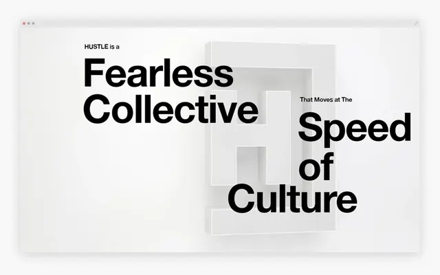 Fearless Collective Typography Layout
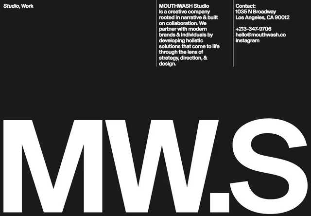 Studio MWS Identity Design
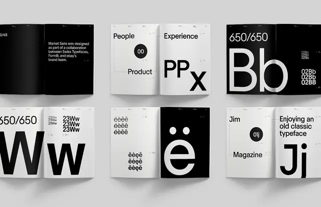 Minimalist Typography and Logo Grid
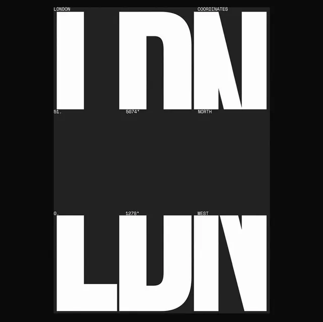 LUNDON Typography Design
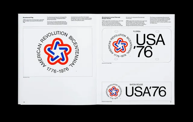 USA76 Identity System
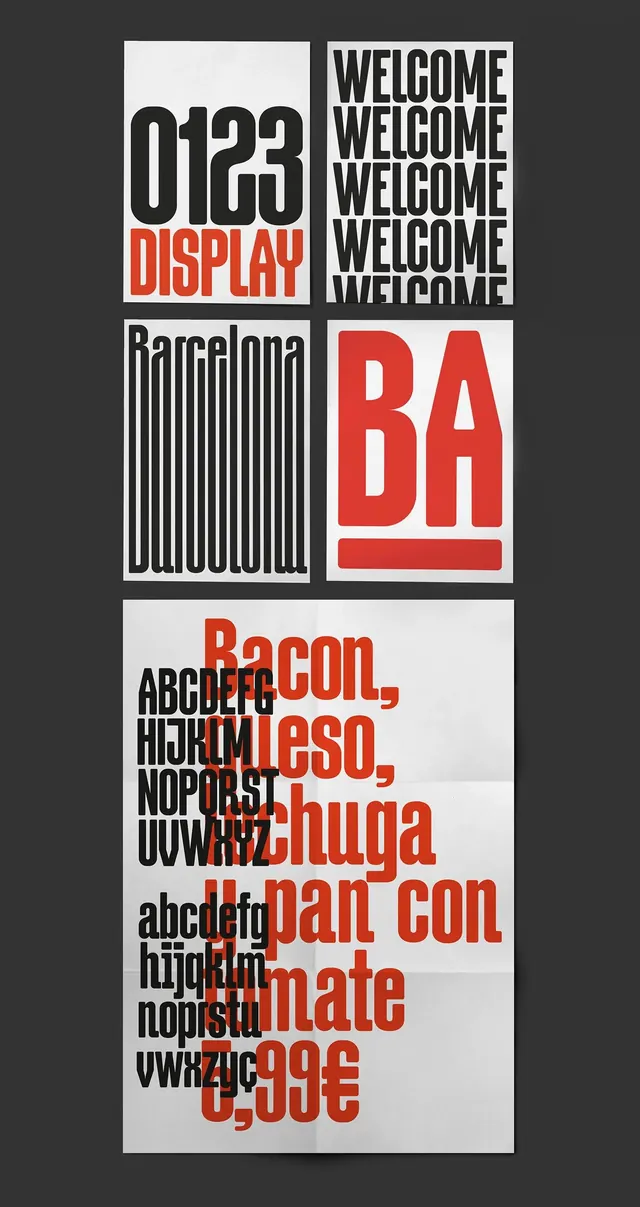 Swiss Typography and Grid Layout Study
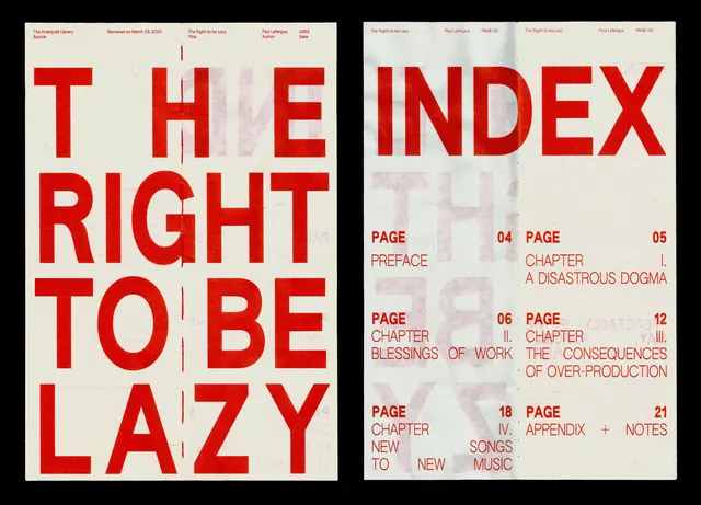 The Right to be Lazy Editorial Spread
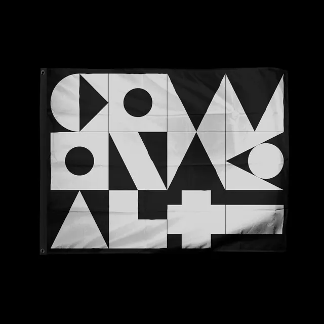 Geometric Typography Composition
 Typography and Graphic Design Elements
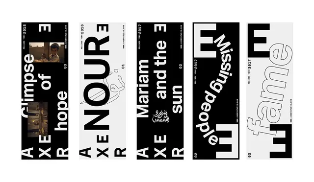 Typography and Graphic Design Reference Board
 Geometric Typography Layout
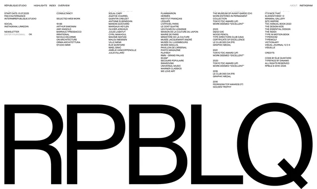 Typography and Wordmark Layout
 JW S Branding Identity System
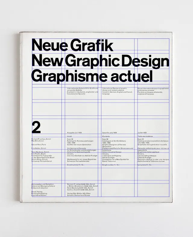 Neue Grafik / New Graphic Design Poster
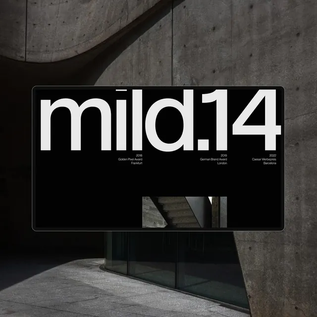 mild14 Wordmark Mockup
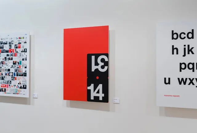 Swiss Style Typography Gallery
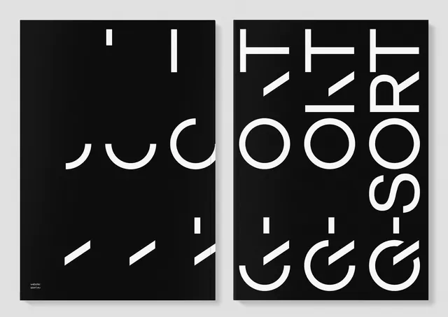 Abstract Typography Composition
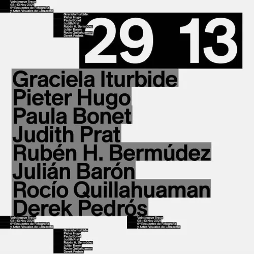 Typography-Driven Poster Design
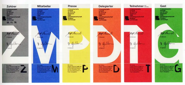 Typography and Color Grid System
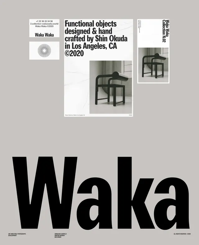 Waka Exhibition Poster
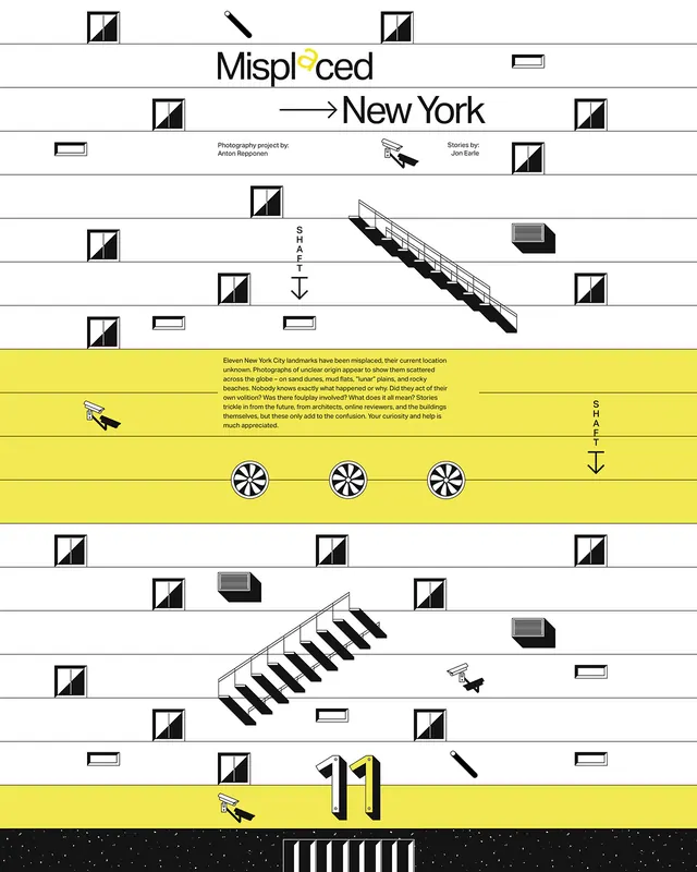 Misplaced New York Identity System
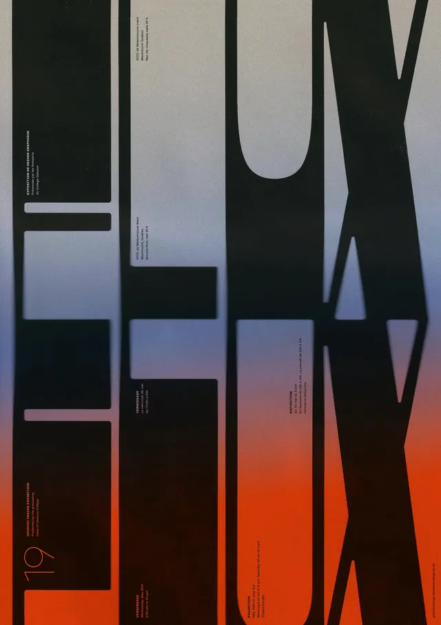 Abstract Geometric Typography Layout
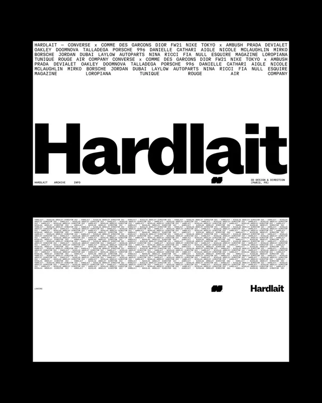 Hardlait Identity System
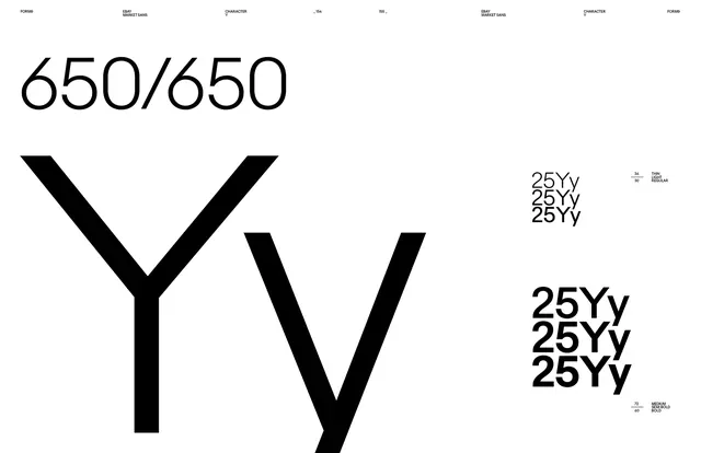 650/650 Typography Study