Typography Layout Study
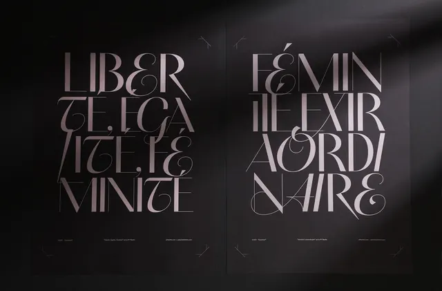
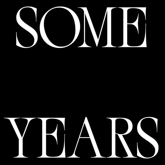
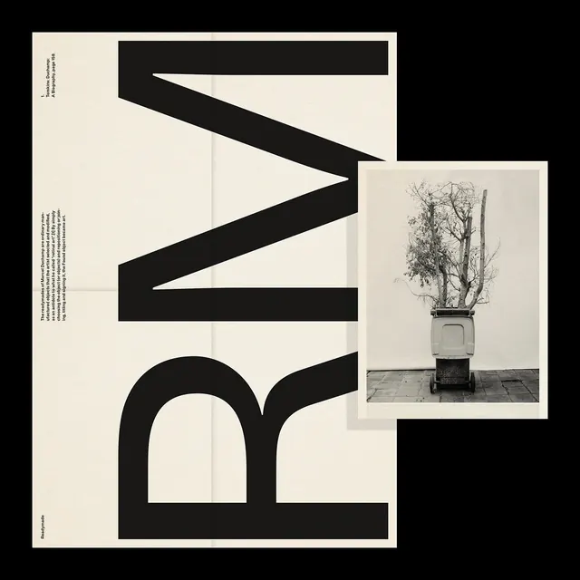
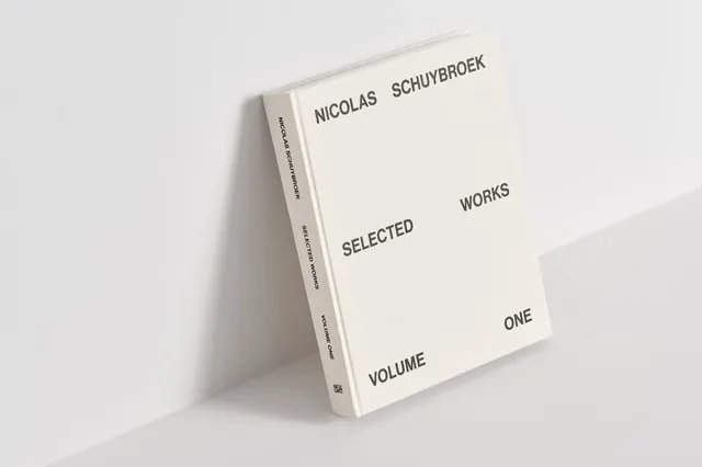
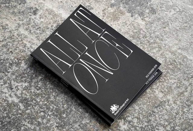
A side-by-side comparison of two different typographic arrangements featuring various words in a serif font.
Summary
A side-by-side comparison of two different typographic arrangements featuring various words in a serif font.
Visual description
Two vertical blocks of text on a dark background, featuring serif words in all-caps. The left side uses a more structured, justified alignment, while the right side features a more dynamic, staggered arrangement.
Key takeaway
Demonstrates how varying the spatial distribution of serif type can create different visual rhythms.
Reuse notes
Use as a reference for high-end editorial layout and sophisticated typographic hierarchy.
StyleMinimal, Editorial, Monochrome, Geometric
ColorDark, Monochrome
MoodElegant, Professional, Calm
Tagstypography, layout, serif, composition, contrast
Palette
#1F1C1E
#B5A7AE
#6B5F63
More like this
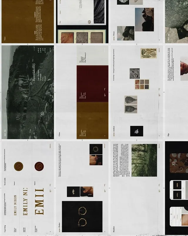 Editorial and Identity Layout Collection
 Editorial and Branding Design Grid
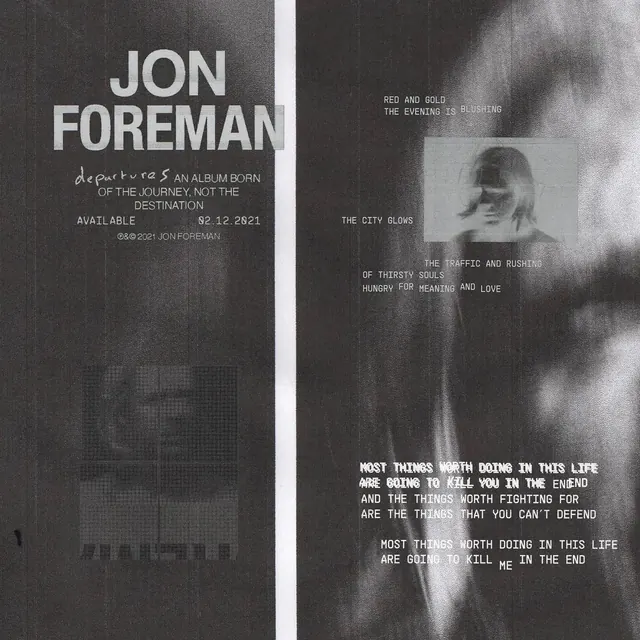 Jon Foreman Editorial Layout
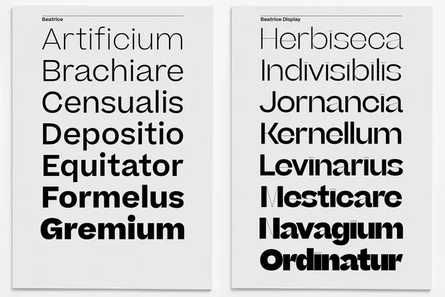 Latin Wordmark Typography Study
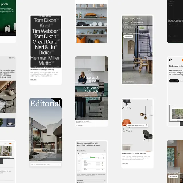 Editorial and Layout Design Collection
 Abstract Geometric and Photographic Collage
 Mixed Media Design Reference Board
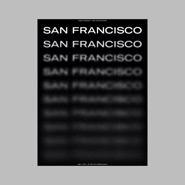 San Francisco Typography Poster
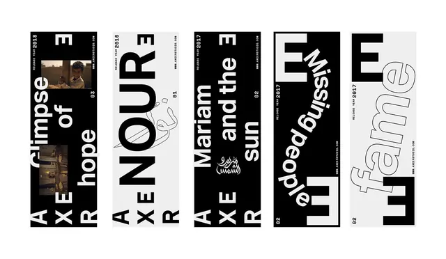 Typography and Graphic Design Reference Board
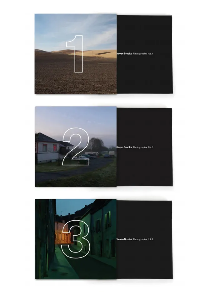 Numbered Landscape Series
 SOME YEARS Wordmark
 Typography and Photography Layout
 Minimalist Editorial Book Mockup
 Minimalist Typography Book Mockup
 Minimalist Branding and Identity System
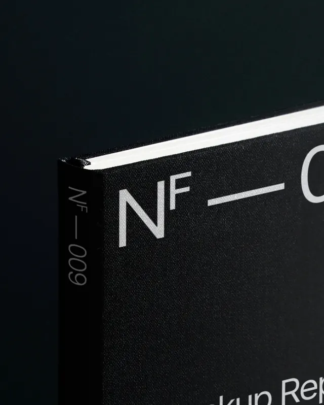 Minimalist Typography Mockup
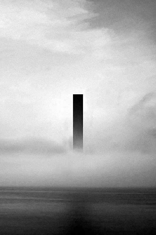 Monolithic Fogscape
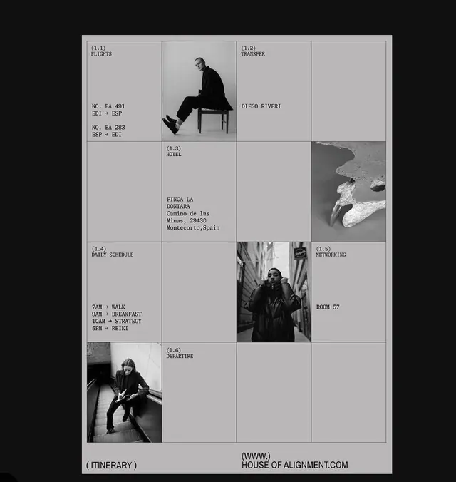 Editorial grid with monochrome photography
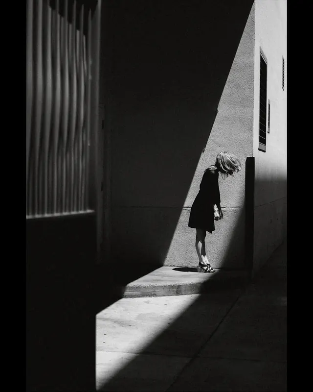 Shadow and Light Architectural Photography
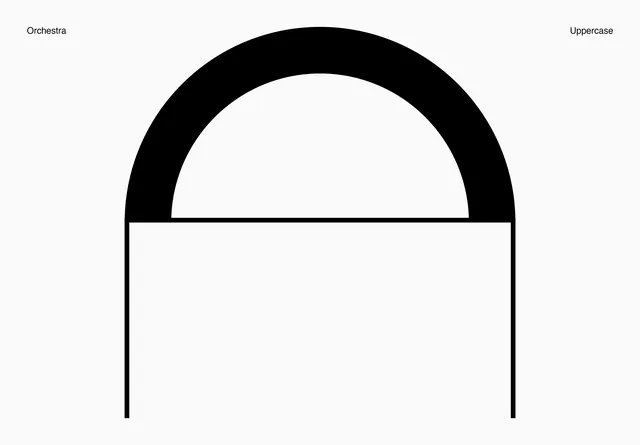 Orchestra Uppercase Logo Design
 Minimalist Editorial Layout
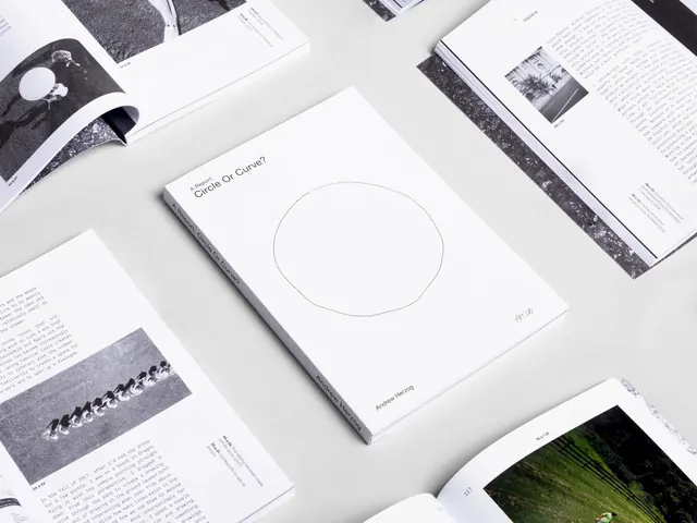 Minimalist Editorial Layout Design
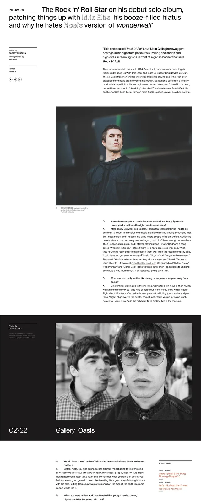 Liam Editorial Layout Design
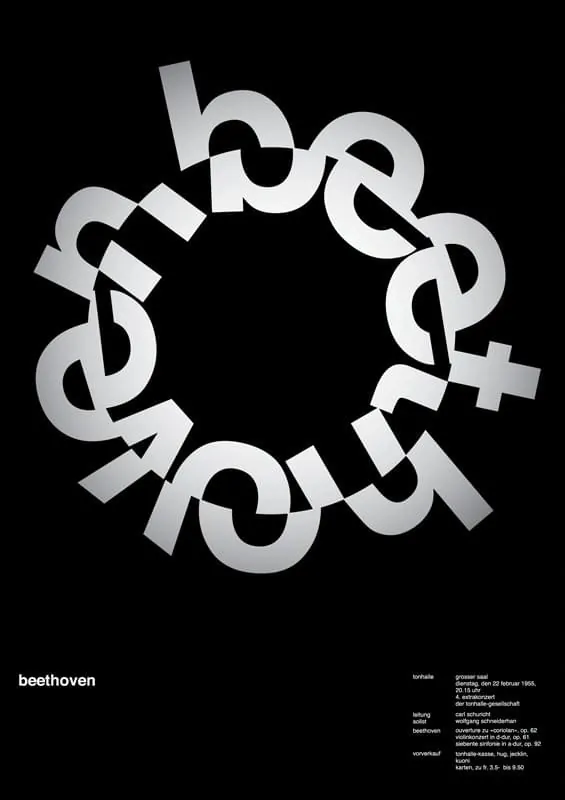 Beethoven Circular Wordmark