Time wordmark clock hand animation
Hot pink field where a black geometric lowercase wordmark breaks apart into clock hands and dots, sweeps through angles, and reassembles into the trademarked lockup.
Summary
A wordmark that behaves like a clock: the strokes of the letters detach, rotate around a pivot the way hour and minute hands would, then settle back into the word.
Visual description
The whole frame is a flat hot pink with no texture or gradient. Centered on it, the wordmark is set in black lowercase in a heavy geometric sans with fully rounded terminals, a curled foot on the t, a round dot over the i and an angled cut on the e, all drawn at a single visual weight so every letter reads as a thick bar or an arc. A small superscript trademark symbol sits at the top right of the final letter. Across the loop the letters break into their parts: pairs of thick black bars set at open angles with a filled dot at their meeting point, floating high or low in the empty pink field like the hands of a clock stopped at different times. The parts sweep through a range of positions, one bar long and one short in the manner of a minute and hour hand, before drifting back together into the intact word. Nothing else enters the frame, so the pink negative space carries the whole transition.
Key takeaway
The wordmark and the symbol are the same object, which means the logo animation argues the concept instead of decorating it. Building the letters at one uniform stroke weight is the technical precondition: it is what lets any fragment read as a clock hand once it detaches.
Reuse notes
A model for any name whose meaning has a natural graphic form, and a reminder to design the letterforms for the disassembly from the start rather than animating a finished logo. The huge flat field is essential breathing room for the pieces to travel, so it needs a full bleed placement rather than a crowded header. Only the one accent color and black are in play, so it drops cleanly onto any brand ground that can take the contrast.
More like this
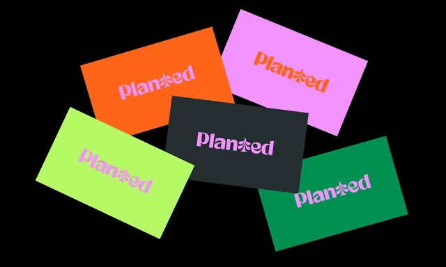 Planted wordmark colourway cards
- Vizi wordmark build with popping green dots
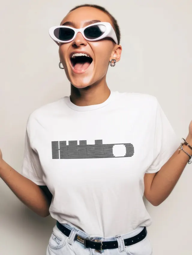 Hullabaloo 2026 festival identity system (slide 8)
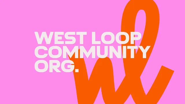 West Loop Community Org. wordmark on pink
 Tutu wordmark in upright and italic halves
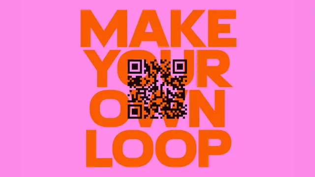 Make Your Own Loop poster with embedded QR code
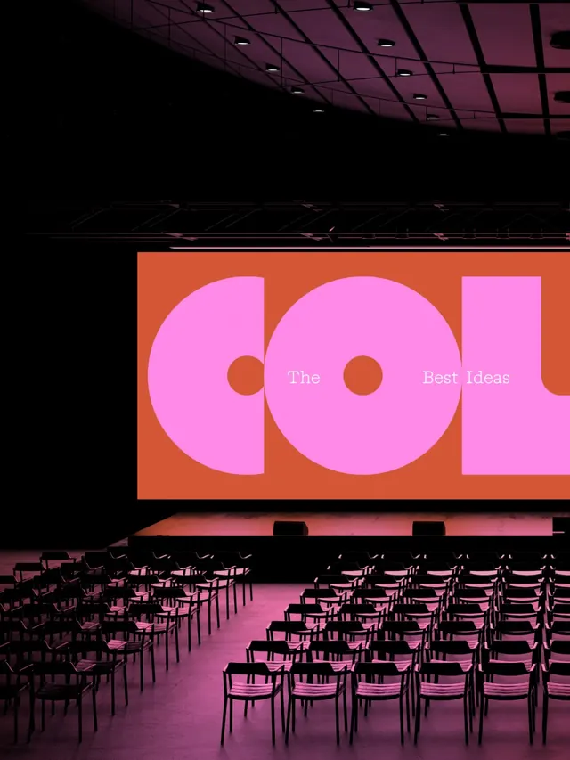 COLAB creative studio brand identity (slide 4)
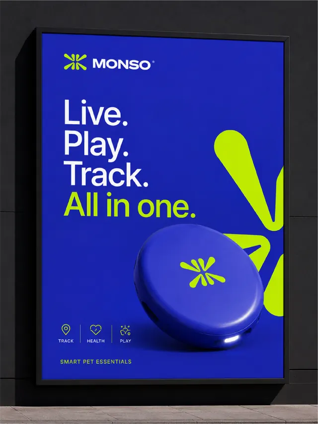 MONSO pet tracker brand identity system (slide 7)
- Ortto wordmark build on electric blue
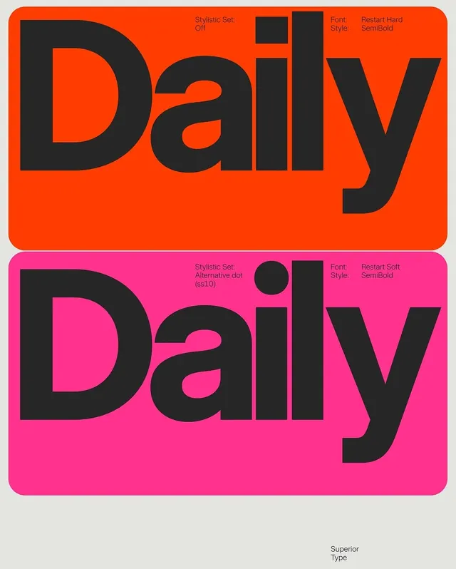 Daily wordmark variations on neon backgrounds
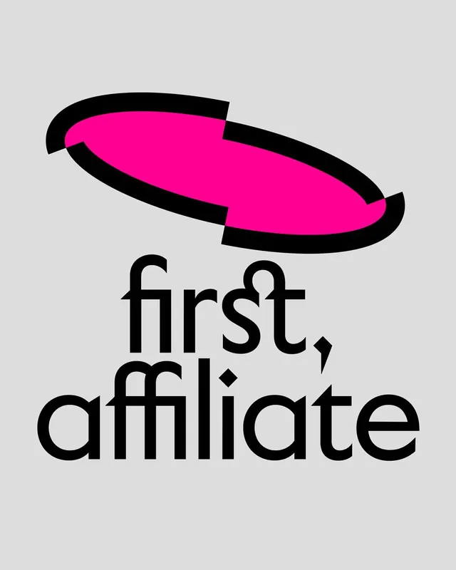 first, affiliate sliced ellipse logo
- Tech Central wordmark over cycling photography
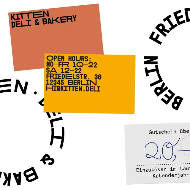 Kitten restaurant brand identity wordmark system (slide 4)
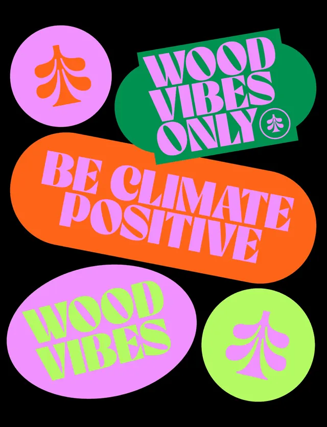 Planted die-cut slogan sticker set
- Neon color-block typography specimen
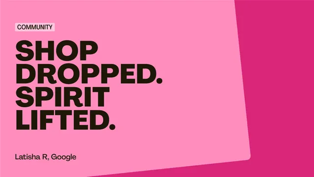 OnHand pink testimonial poster with oversized all-caps quote
- Deezer wave heart logo animation
 air up pink wordmark on deep plum
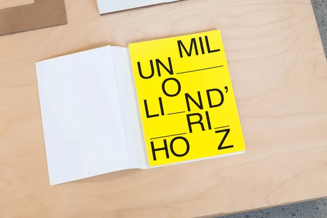 Bright yellow notebook with fragmented text
 Spill the Milk Podcast logo
 Living Things smiling wordmark lockup
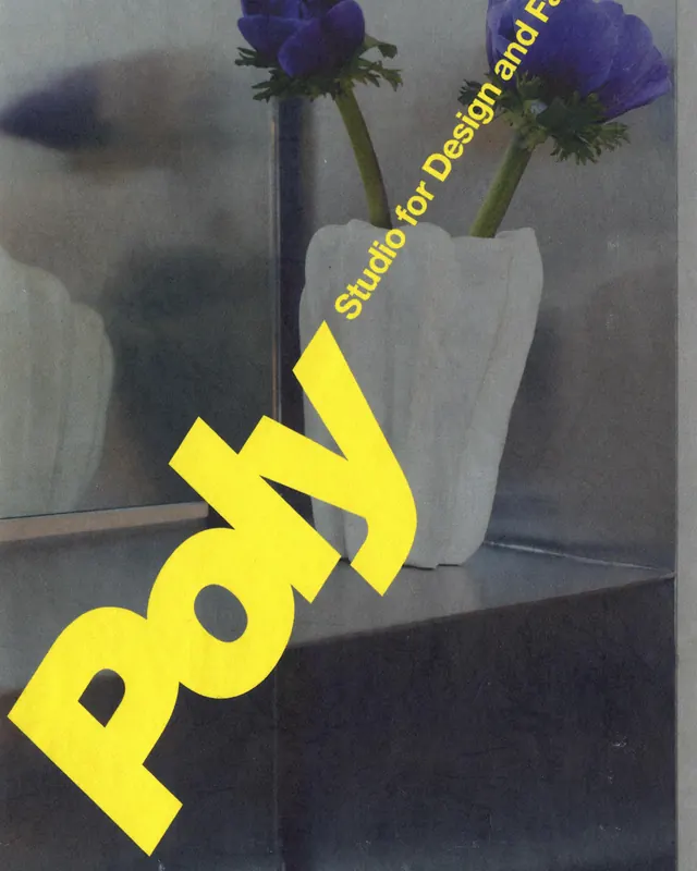 Poly Studio brand identity and website (slide 1)
 Fork & Good curved wordmark on red
- KOMERO letters tumbling into a stacked lockup