Patch
A polished brand and product presentation for Patch combines logo development, mockups, and colorful campaign visuals across digital and outdoor applications.
Summary
A polished brand and product presentation for Patch combines logo development, mockups, and colorful campaign visuals across digital and outdoor applications.
Visual description
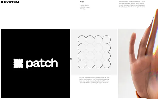
A white logo consisting of a 4x4 grid of fused circles and the word patch in a bold, lowercase sans-serif typeface is centered on a black background. To the right, a technical diagram shows the logo's construction using thin grey outlines of sixteen circles. A third panel shows a close-up photograph of a hand with a prismatic, rainbow-colored light leak overlay.
Key takeaway
Use a geometric construction grid of overlapping circles to create a soft, organic custom glyph.
Reuse notes
Reach for this as a identity system reference. Pairs with clean, 3d directions. Original by Daryl Ginn.
More like this
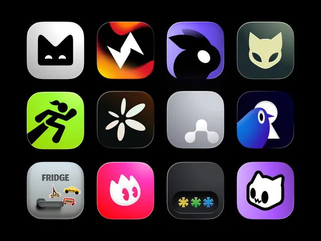 App Icons
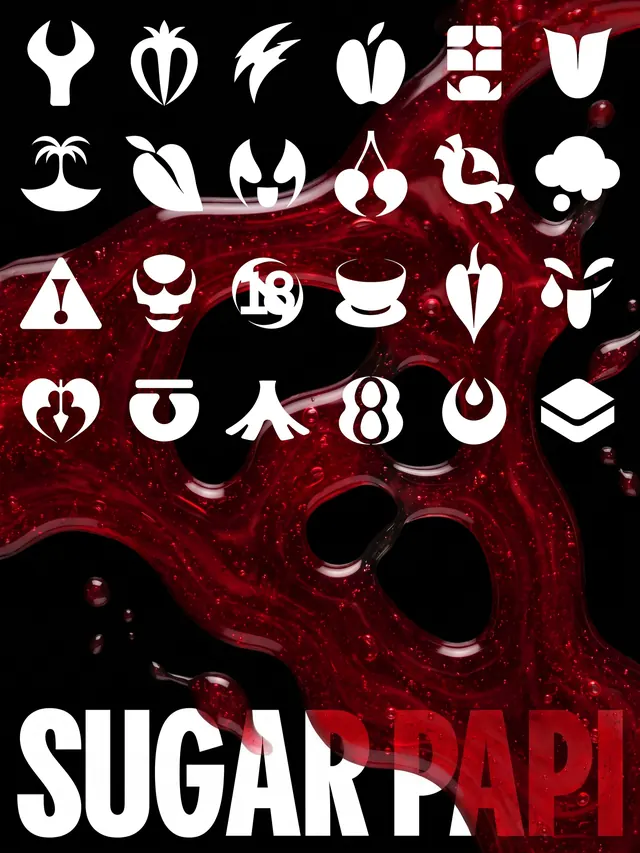 Sugar Papi brand identity and packaging carousel (slide 9)
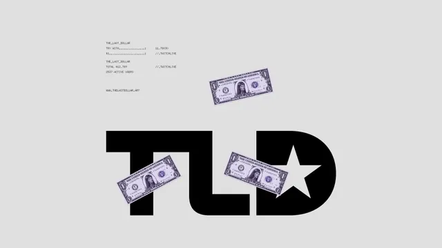 The Last Dollar
 Netflix AIMS Identity
 Spills Coffee logo
 Stamps Brand Identity
 GenK
 COLAB creative studio brand identity (slide 5)
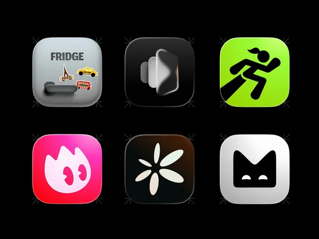 App Icon Set
 Lil Guys App Icons
 3 Logos
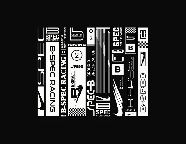 Nike B-SPEC racing strip system
 Ghost logo
 Juniq Brand Identity
 Nomad Systems Label design
 KEW museum brand identity system
 Alohi logo
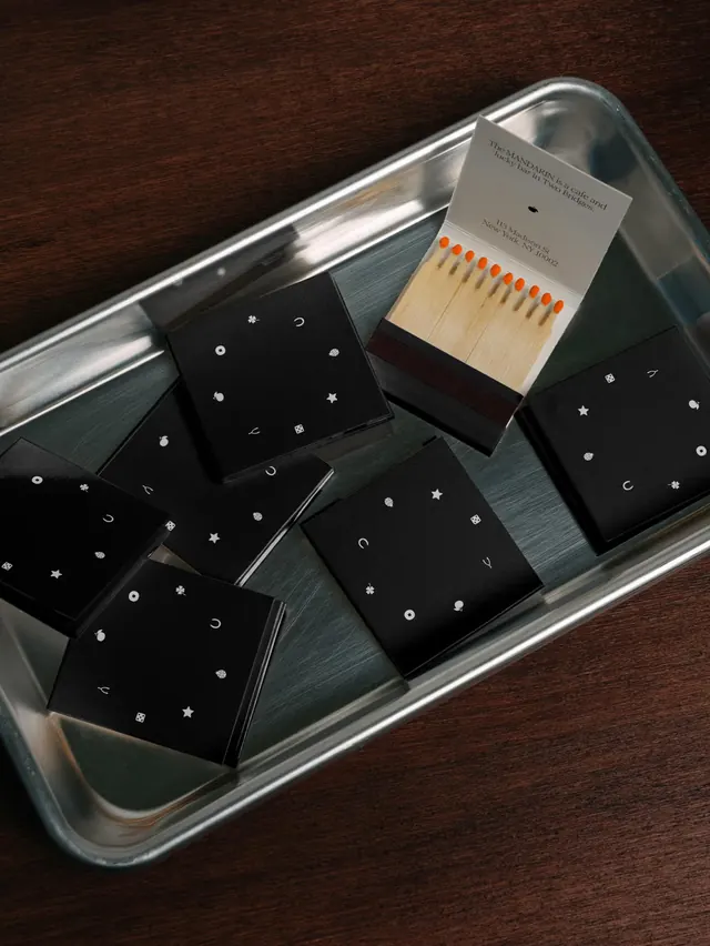 The Mandarin NYC branding and environment design (slide 3)
 Blendy logo
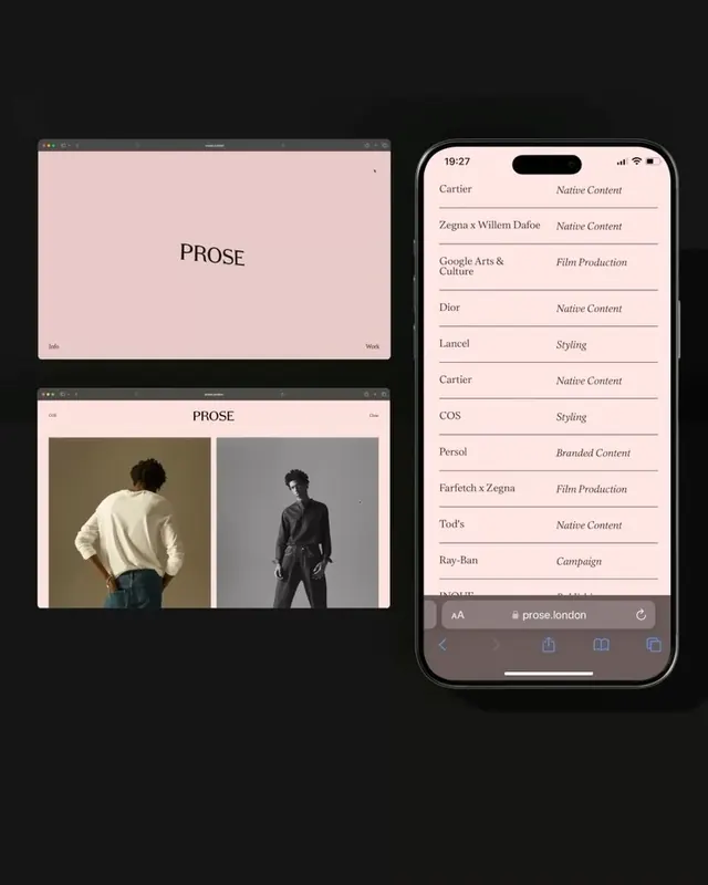 Prose brand identity system (slide 4)
 MONSO pet tracker brand identity system (slide 9)
 Workflow Acceleration
 Golden Wolf 13 Years anniversary animated celebration (slide 7)
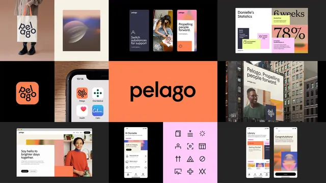 Pelago brand system multiformat showcase