Main jackfruit pouches on deep green
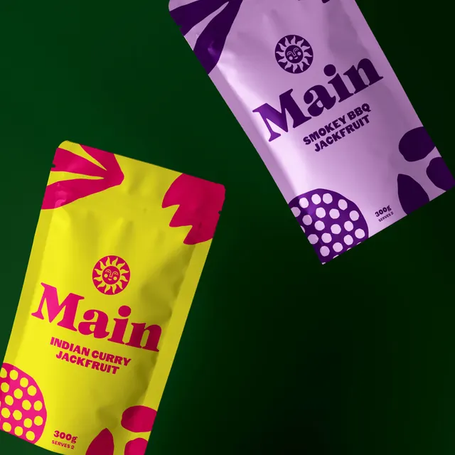
Two foil food pouches in acid yellow and lilac tumbling across a deep green field, each carrying a smiling sun mark and a heavy serif wordmark.
Summary
Two flavour variants of a stand-up food pouch photographed at opposing angles on a deep green background, each running a single bright colour against one contrasting ink.
Visual description
A square frame filled with a dark forest green that deepens toward the bottom right. Two matte foil pouches float diagonally, one entering from the top right and one from the lower left, tilted in opposite directions so they mirror each other across the empty centre. The lower pouch is acid yellow printed in hot pink; the upper is pale lilac printed in deep purple. Both share the same layout: a circular sun icon at the top with a simple smiling face at its centre and short triangular rays, then the word Main below it in a heavy high-contrast serif with a long tail on the final stroke, then the flavour in two lines of bold condensed caps, INDIAN CURRY JACKFRUIT on the yellow pouch and SMOKEY BBQ JACKFRUIT on the lilac. A 300g weight and a SERVES 2 line sit in the lower corner. Cut-paper style shapes bleed off the pack edges: a partial sunburst at the top seal, a large circle filled with an even grid of dots at the bottom, and loose leaf or petal forms along the sides. The foil catches a soft highlight down the centre of each pouch.
Key takeaway
One flat colour plus one printed ink per pouch keeps a bright range instantly sortable on shelf while the illustration system stays identical across variants. Cropping the decorative shapes at the pack edge implies a much larger pattern continuing behind the pouch.
Reuse notes
A good model for a food or snack range that needs shelf pop and a friendly face without a mascot illustration on every pack. The dark green backdrop is doing a lot of the contrast work, so the same pouches would need rechecking on a white retail shelf. Two-colour printing on foil limits photographic ingredient imagery, which suits a plant-based positioning but not a premium indulgence one.
More like this
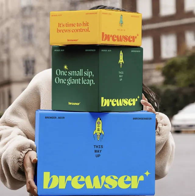 Brewser stacked shipping boxes in yellow, green and blue
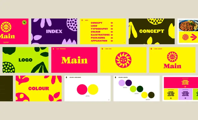 Main brand guidelines slide grid
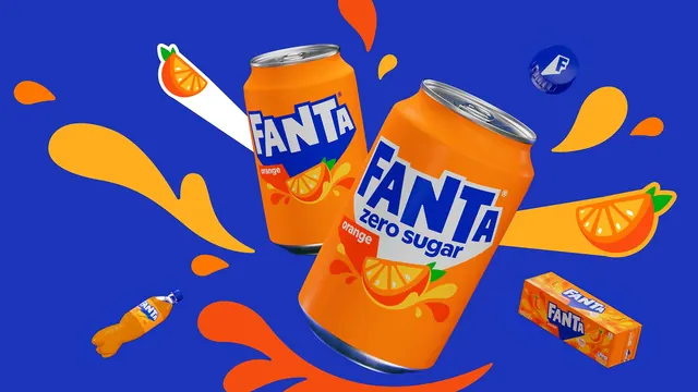 Fanta orange hero can key visual
- Happy Viking flavour range packaging cycle
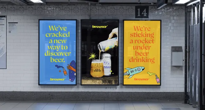 Brewser transit poster triptych on a tiled station wall
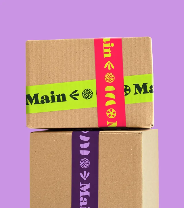 Main branded packing tape on stacked boxes
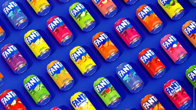 Fanta flavour range can grid
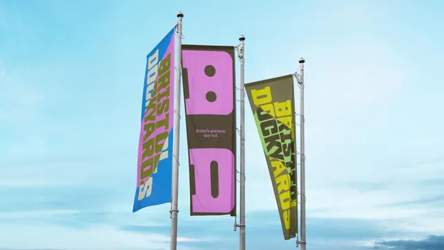 Bristol Dockyards flags with warped condensed lettering
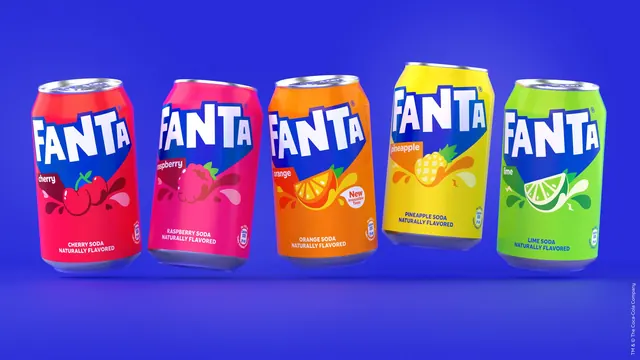 Fanta five-can flavour lineup
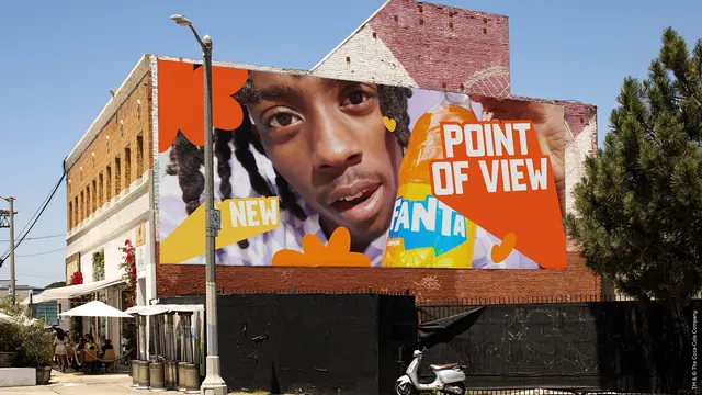 Fanta Point of View wall billboard
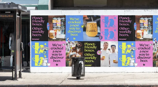 Brewser wheatpaste poster wall in alternating colour blocks
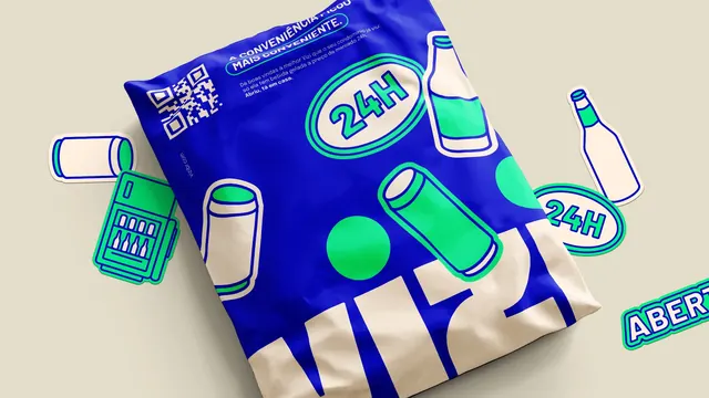 Vizi blue mailer bag with cut-out stickers
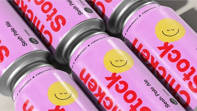 Rotorious pink beer cans with wrapping red display type
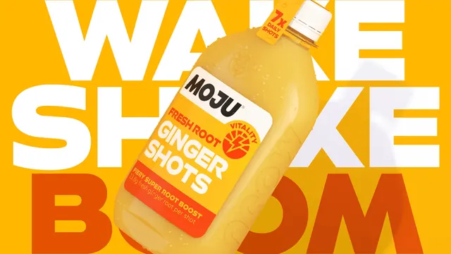 MOJU ginger shots bottle over oversized WAKE SHAKE BOOM type
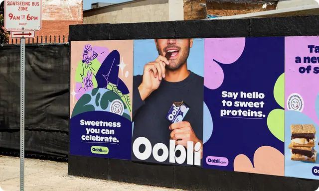 Oobli poster series pasted on a street hoarding
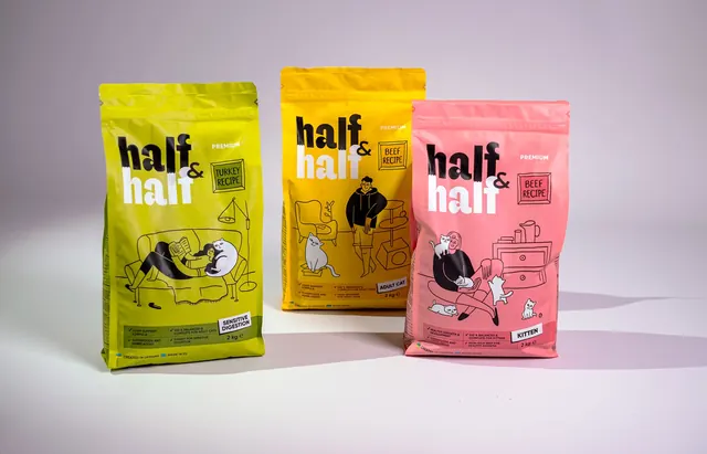 Half and Half cat food pouch trio
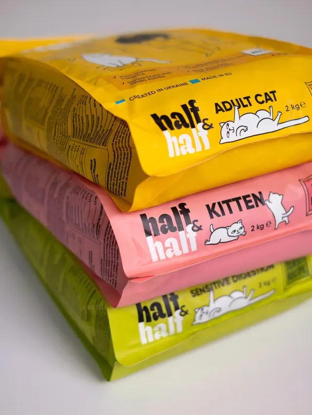 Half and Half cat food pouches stacked
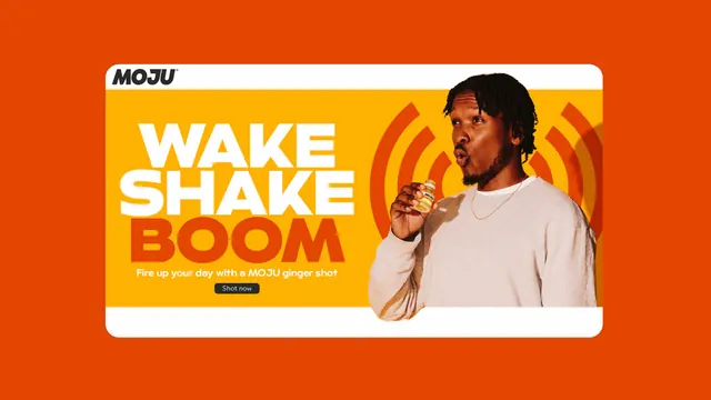 WAKE SHAKE BOOM campaign banner with sonic rings
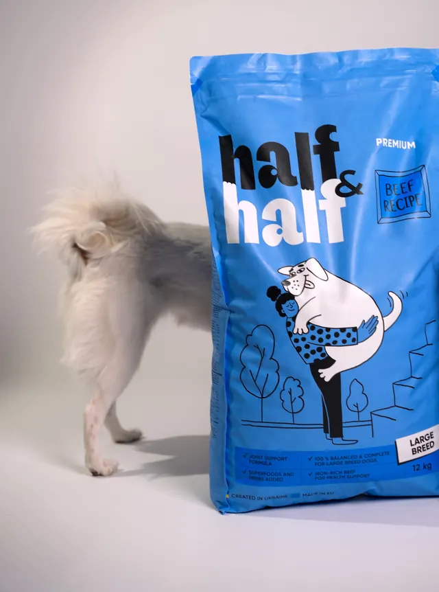 Half and Half large breed pack with dog
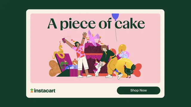 Instacart A piece of cake ad unit with party illustration
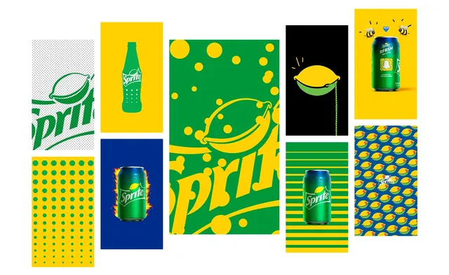 Sprite beverage identity system with geometric pattern library
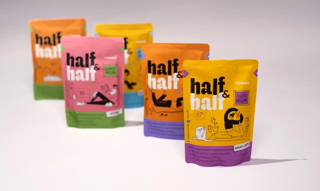 Half & Half cat food pouch range
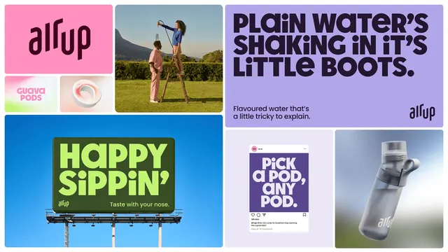 air up identity applications grid
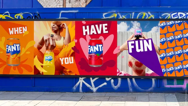 Fanta hoarding billboard with WHEN YOU HAVE FUN panels