UI Guidelines for Unity
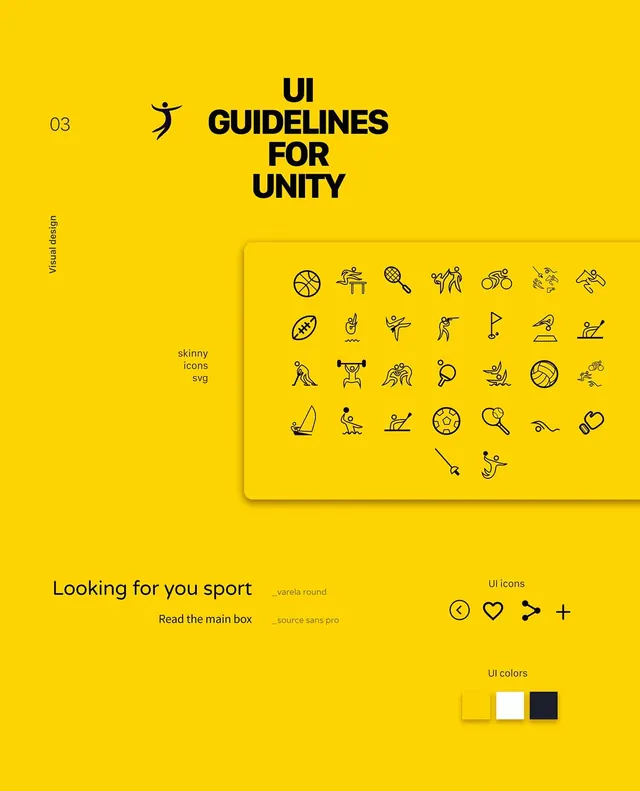
A comprehensive UI design system guide featuring a grid of icons, typography specimens, and layout components on a solid yellow background.
Summary
A comprehensive UI design system guide featuring a grid of icons, typography specimens, and layout components on a solid yellow background.
Visual description
A bright yellow layout featuring a large black heading, a dense grid of diverse line-art icons, and various UI elements like buttons and input fields. The design uses a strict grid system with clean black typography.
Key takeaway
High-contrast color schemes combined with a dense icon library create a highly functional and organized design system.
Reuse notes
Use the grid layout and icon style for creating consistent UI components across a digital product.
ColorVibrant, High Contrast
TypeSans Serif, Oversized, All Caps
MoodBold, Professional, Energetic
IndustryAi, Developer Tool, Productivity, Saas
Tagsui kit, iconography, design system, grid, layout
Palette
#FAD105
#2B250E
More like this
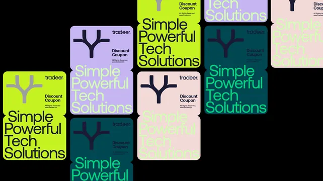 Tradeer discount coupon cards in four colourways
 Minimalist Analog Clock Design
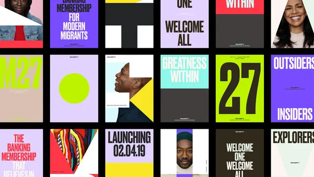 Grid-Based Graphic Design Reference
 Geometric Circular Identity
 Logo Collection Grid
 OXEAM Campaign Grid
 Kortex teal wordmark with mint arrow mark
 Granola AI notepad brand identity (slide 8)
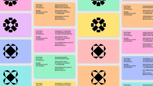 National Gallery of Canada bilingual business card grid
 Bold H Lettermark
 Minimal dark-mode identity system
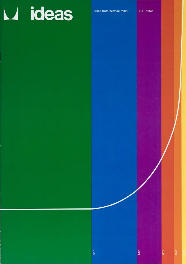 Ideas Identity System
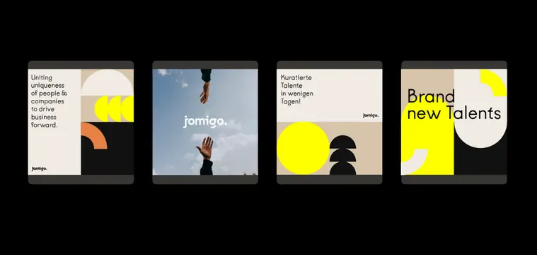 Jomigo social tiles in black and yellow
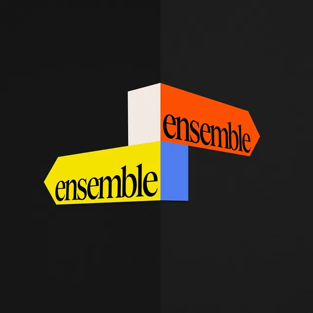 Ensemble color-blocked identity system
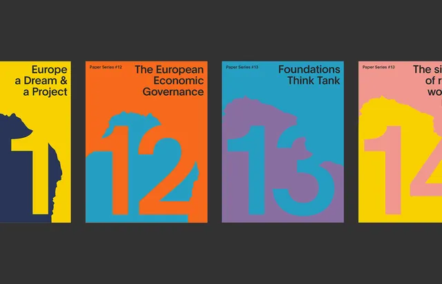 Coppieters Foundation paper series covers
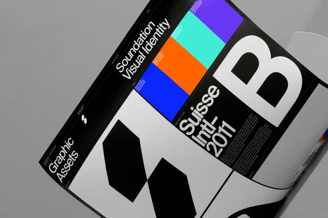 Soundation identity guide spread
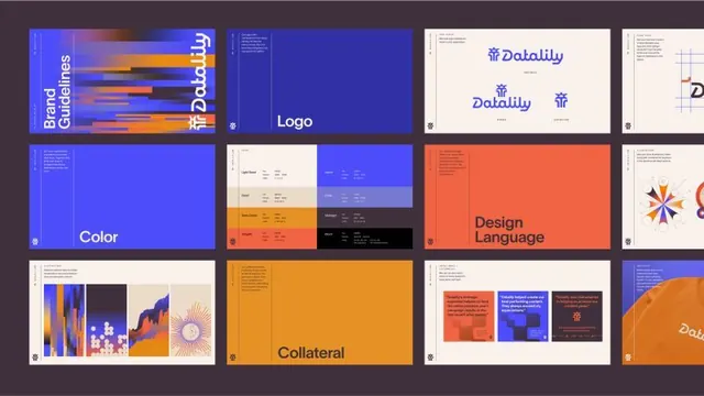 Datalily brand identity system with blue and orange geometric language
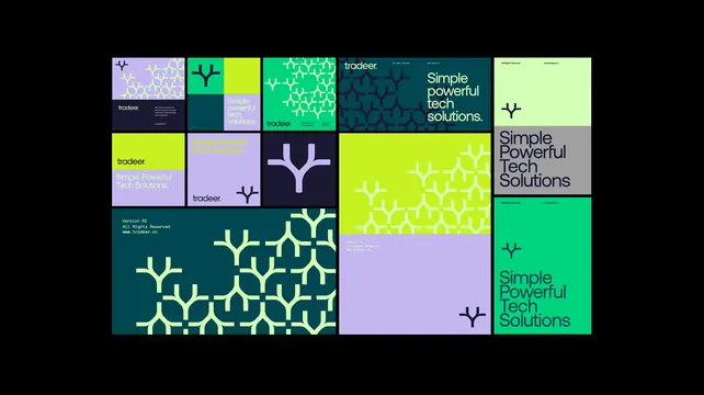 Tradeer brand system tile grid
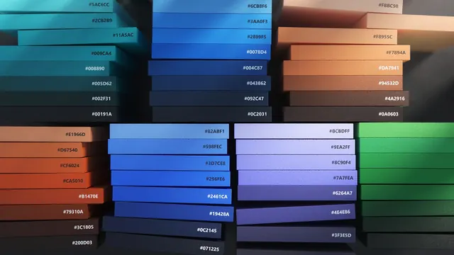 Stacked Rectangular Identity System
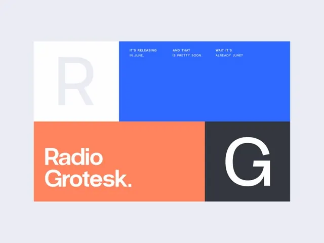 Radio Grotesk color-blocked type promo
 Geometric Navigation Identity System
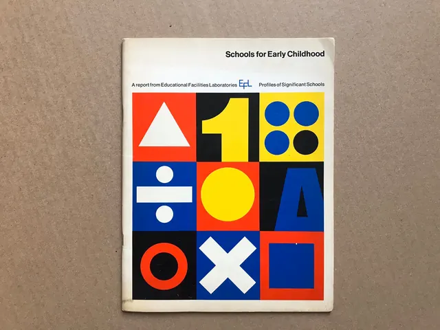 Schools for Early Childhood Identity
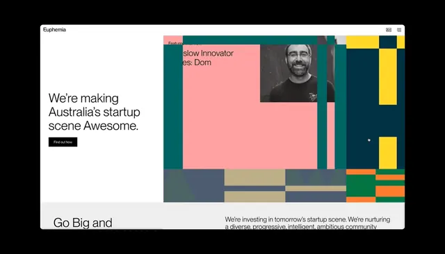 Euphemia homepage split between statement and color mosaic
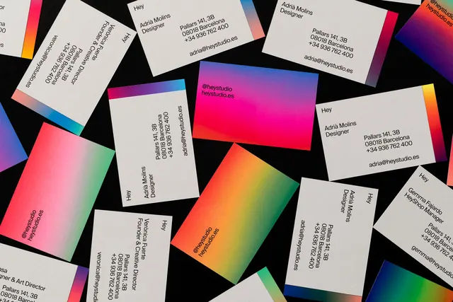 Geometric Gradient Identity System