Education Elements mobile site and lilac print sheet
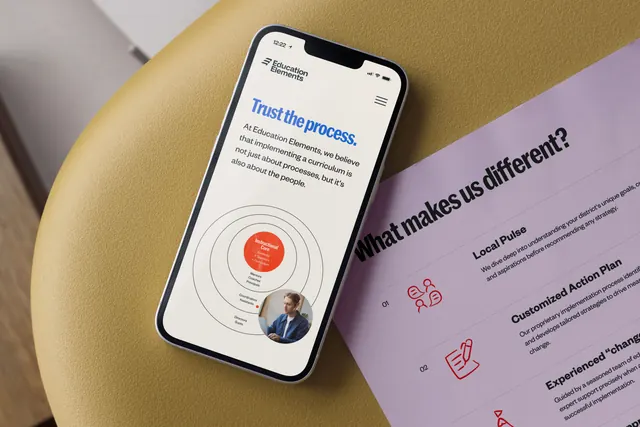
An angled desktop shot pairs a phone showing the brand's mobile site with a lilac printed sheet listing numbered differentiators beside red line icons.
Summary
One frame showing the identity working across two media at once: a mobile web screen on a phone and a printed lilac leave-behind, both photographed at a shared diagonal.
Visual description
The composition is rotated roughly thirty degrees. Upper left, a white phone rests on a mustard yellow upholstered stool; its screen shows a cream page with the two-line logo lockup top left and a hamburger icon top right. The headline "Trust the process." runs large in blue heavy condensed sans, followed by a paragraph of dark body copy in a lighter weight. Below sits a concentric-ring diagram: four thin black circles around a filled orange red center labelled "Instructional Core", with small labels stepping outward on each ring and a circular photograph of a person at a desk masked into the outermost ring at lower right. To the right, a lilac sheet lies on a darker surface, carrying the question "What makes us different?" in large black condensed sans and a numbered list beneath: "01 Local Pulse", "02 Customized Action Plan", "03 Experienced change" with two lines of grey body copy each and a red outlined icon (speech bubbles with figures, a hand writing on a document) at the left of each entry. The sheet runs off the right edge, so the third entry is cropped.
Key takeaway
The diagram is the interesting move: a plain concentric model becomes brand property by filling the core with the identity orange and masking a real photograph into the outer ring. Alongside it, a numbered list carried by outlined red icons shows the same system in a quieter, print register.
Reuse notes
Useful when a case study or portfolio page has to demonstrate cross-media consistency in a single image, and as a layout reference for consulting-style one-pagers with a framework diagram. The steep angle looks good but makes the right-hand copy hard to read, so it works better as a hero image than as a documentation frame.
More like this
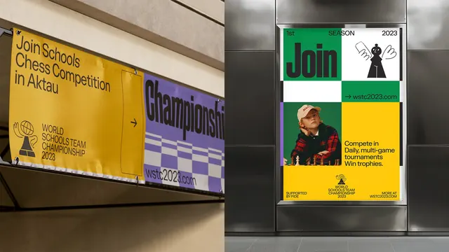 WSTC 2023 hanging banners and transit poster
 WSTC 2023 tournament hall with purple caption block
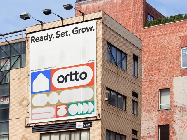 Ortto building billboard with shape grid
 Instacart billboard with You, Me, Umami headline and studio food photography
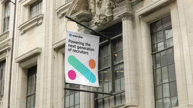 Facade banner with cross motif on a heritage stone building
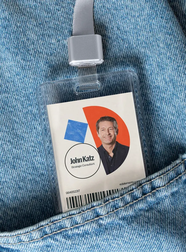 Education Elements ID badge in a denim pocket
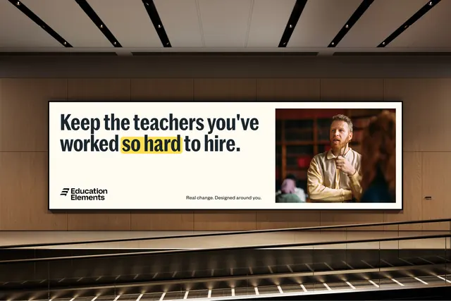 Education Elements transit billboard with highlighted headline
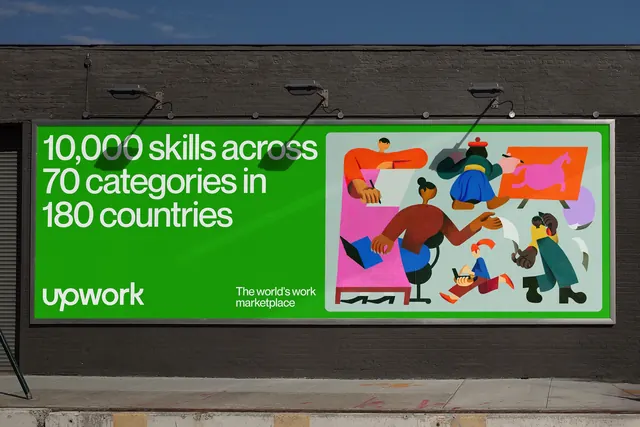 Upwork green billboard with painterly illustration
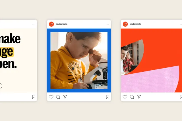 Education Elements social post templates
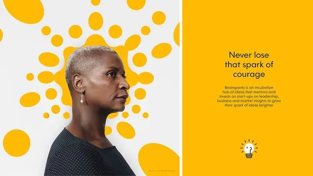 Brainsparks yellow-dot split brand spread
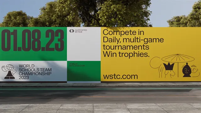 WSTC 2023 roadside hoarding
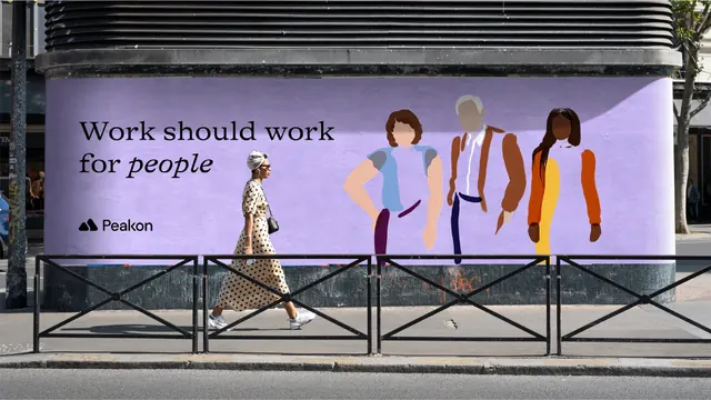 Peakon purple billboard on a street corner
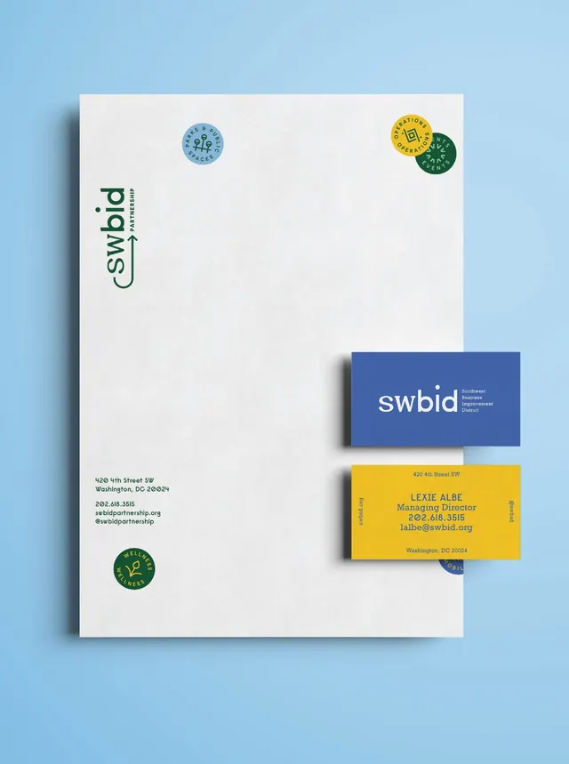 SWBID letterhead and business card stationery
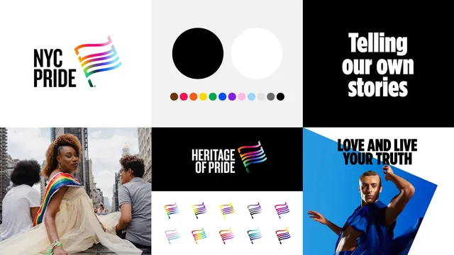 NYC Pride identity system overview grid
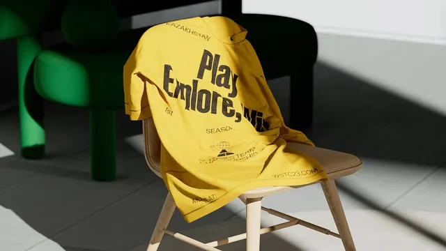 WSTC 2023 printed t-shirt on a chair
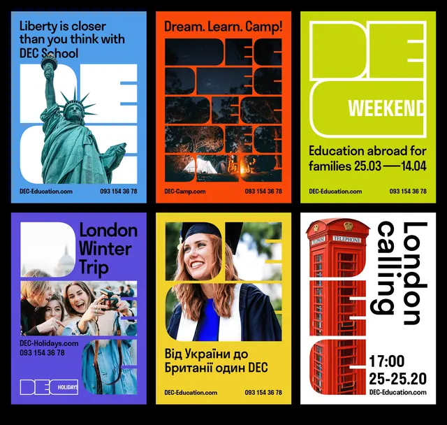 DEC poster series in six brand colors
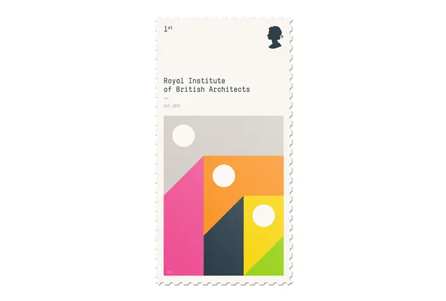 RIBA Architects UK stamp: geometric modernist design
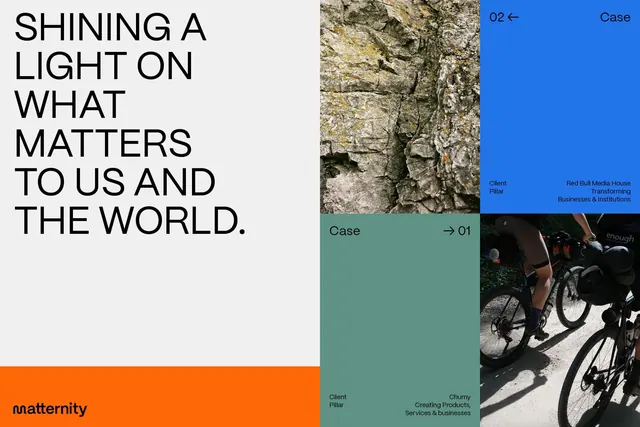 Maternity brand case study grid layout
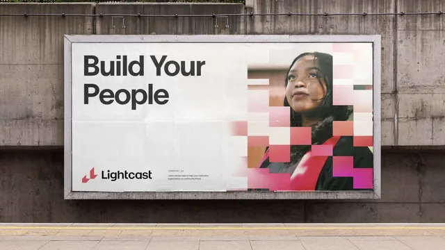 Lightcast 'Build Your People' billboard with pixel-mosaic portrait
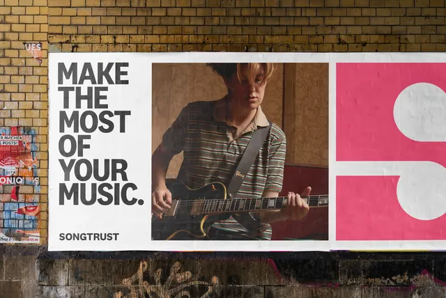 Songtrust wheatpaste billboard on brick
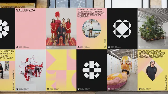 National Gallery of Canada hoarding poster grid
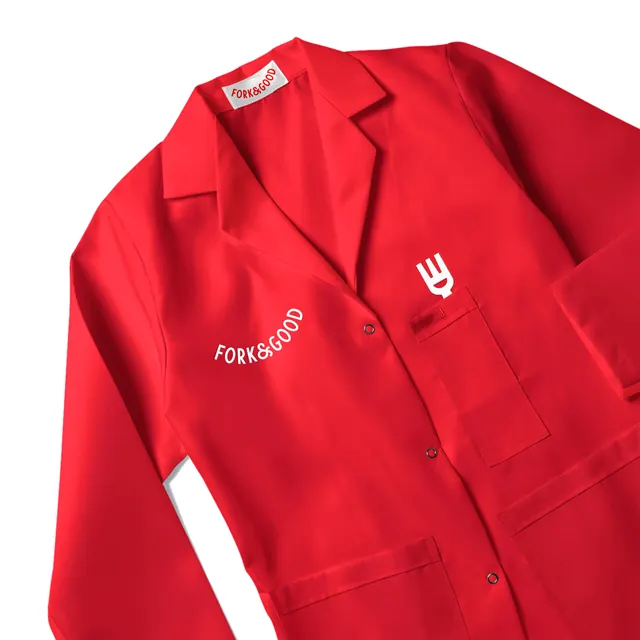 Fork & Good red work coat with curved wordmark
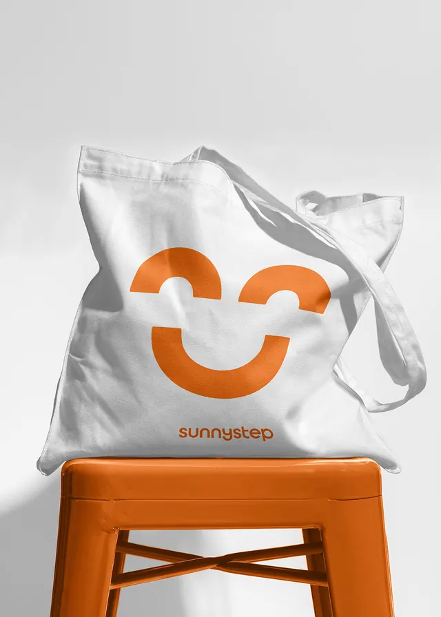 SunnySTEP smile mark tote on orange stool
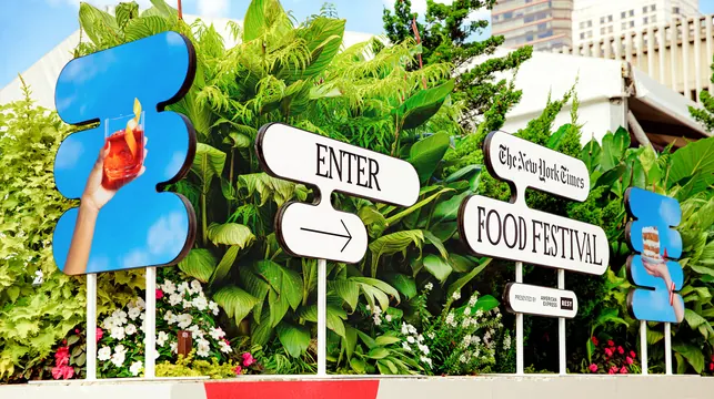 Food festival entrance sign cluster