Drops logo
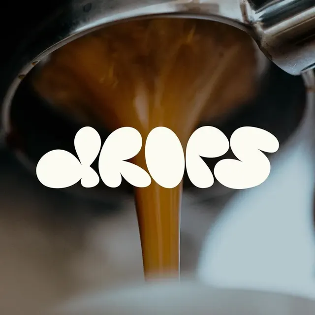
Bold, organic wordmark with rounded, flowing letterforms in white, conveying liquid elegance and smooth movement.
Summary
Bold, organic wordmark with rounded, flowing letterforms in white, conveying liquid elegance and smooth movement.
Visual description
The logo consists of the word "drops" in a thick, rounded, bubble-style typeface. The letters are solid white and overlap slightly. The text is centered over a photograph of brown liquid pouring from a metal spout.
Key takeaway
Use an ultra-bold, rounded typeface with overlapping characters to create a cohesive, fluid shape.
Reuse notes
Reach for this when designing a wordmark for food & drink, e-commerce & dtc. Pairs with modern, friendly identity systems. Original by Gordesigns.
ColorLight, Earthy, Monochrome, High Contrast, Warm
TypeSans Serif
MoodProfessional, Friendly, Calm, Fun
IndustryFood
Tagsliquid, organic, rounded, contemporary, responsive design, clever negative space, One word, Circle, Letterform, Negative space, Rounded, Bold, Sans Serif, wordmark, wordmark: DROPS, complementary, warm, orange, yellow, teal
Palette
#5F5A53
#B4C8CD
#552D0A
#FCFBF2
#020302