Barnardos logo
Playful green wordmark with wavy organic banner shape and small tree and heart icons, designed for children's charity.

Summary
Playful green wordmark with wavy organic banner shape and small tree and heart icons, designed for children's charity.
Visual description
The logo features the word BARNARDO'S in a chunky, irregular sans-serif typeface. The dark green letters are set inside a matching dark green organic, blob-like shape against a light green background. The letter R includes a small heart detail in the counter.
Key takeaway
Enclose irregular typography within a single, organic silhouette to unify disparate letterforms into one cohesive graphic mark.
Reuse notes
Reach for this when designing a wordmark for non-profit, education. Pairs with friendly, playful identity systems. Original by The Clearing.
More like this
 Handover logo
 Erthos logo
 Homdio logo
 LivingThings logo
 Cantina logo
 Do I Do logo
 VisionCamp logo
 Bugg logo
 Bernadi logo
 JamJam logo
- Playful 155
 Dieter logo
 Coldhug logo
 Green at Heart logo
 Ogoori logo
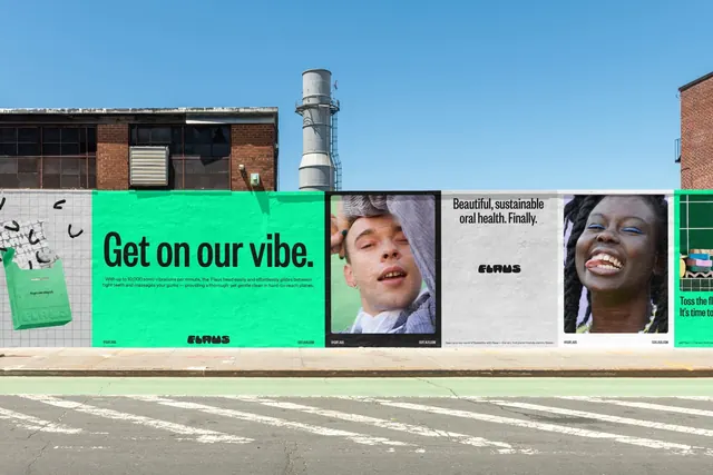 Flaus wheatpasted poster wall in bright green
 Anja logo
 Cool Cat's logo
 Moflotte Logo design logo
 Springboard logo
 Erne logo
 Walony logo
 MadeForMed logo
 WasteSide logo