Preview image. Unlock full-res
GitHub guidelines - Mona Sans typography intro
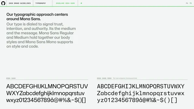
Typography opener centering the type system on Mona Sans, with full uppercase and lowercase specimens of Mona Sans and Mona Sans Mono.
More like this
See all
Summary
The typography chapter opener: the system centers on Mona Sans, shown through large full-character specimens of Mona Sans and its companion Mona Sans Mono.
Visual description
A left headline ("Our typographic approach centers around Mona Sans.") sits over a gray paragraph describing the type as signaling trust and authority, with a green "DOWNLOAD MONA SANS" link with arrow in the header bar. The lower half splits into two specimens under monospace labels: MONA SANS and MONA SANS MONO, each a large three-line block of A-Z, a-z, 0-9 and symbols. The proportional cut is geometric; the mono cut is fixed-width. Off-white background with the standard header and green rule above.
Key takeaway
Opening a type section with a clear statement of the hero family plus an immediate full-glyph specimen of both the proportional and mono cuts, so the typeface's character and breadth are visible at once.
Reuse notes
A strong default for documenting a primary typeface and its mono companion together. The full-alphabet specimens make it easy to judge the type and confirm the character set.
From this deck: GitHub guidelines - Mona Sans typography intro
View deck