Preview image. Unlock full-res
More like this
See all
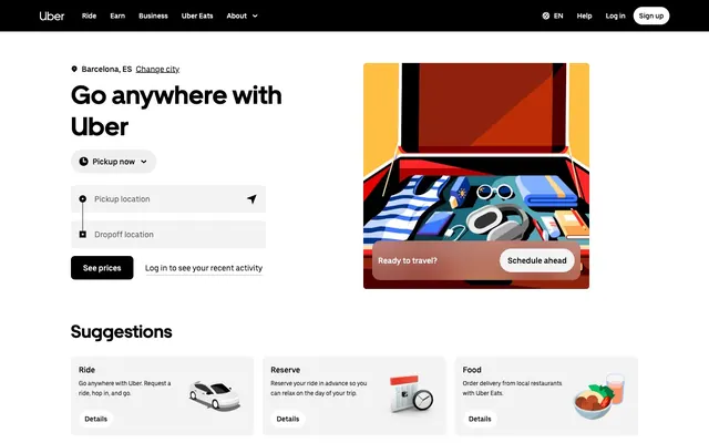
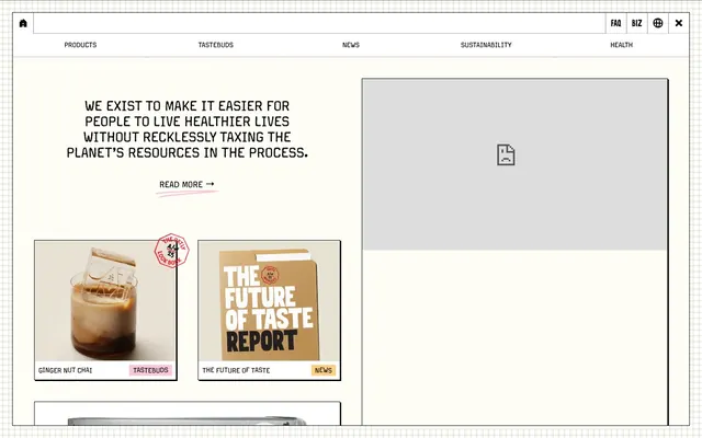
Color palette
Page backgrounds, underlying surfaces
Dark borders and separators for elevated surfaces and inverted UI. Do not promote it to the primary CTA color
Typography
- Weights
- 400, 700
- Sizes
- 14px, 16px
- Line height
- 1.43, 1.5
- Fallback
- Montserrat, Open Sans
Functional text: used for all body copy, navigation links, and footer information, usually in an all-caps form. Its consistent weight and clear letterforms provide an anchor to the unique branding.
- Weights
- 700
- Sizes
- 16px
- Line height
- 1.5
- Fallback
- Tangerine, Great Vibes
Decorative display font for primary brand statements, giving an elegant, bespoke feel. Used sparingly for key headings.
Spacing & shape
Components
Fokus font, 14px, weight 400, color #000000. Underlined on hover.
Fokus font, 14px, weight 400, color #000000, uppercase. Padded by 32px on top, right, and bottom. Margins of 16px between elements.
Chronik font, 16px, weight 700, color #000000, uppercase. Line height 1.5. Centered on the page.
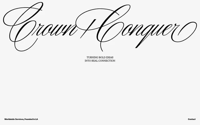
Custom script font rendered as an image, visually large and centered.
Guidelines
- Use Canvas (#f5f5f5) as the primary background for all page sections.
- Employ Midnight Ink (#000000) for all text elements to maintain high contrast and sophistication.
- Apply Fokus font with a weight of 400 for all body text, navigation, and footer details, typically in uppercase.
- Utilize Chronik font exclusively for primary brand statements or key headings, maintaining its default weight of 700.
- Maintain a minimum element gap of 16px between UI items horizontally and vertically.
- Use 32px for section padding, especially for top and bottom margins of major content blocks.
- Center all significant page sections and content blocks, adhering to the expansive full-bleed page model.
- Do not introduce additional background colors; maintain the stark #f5f5f5 background throughout.
- Avoid using saturated or chromatic accent colors in UI elements; color is reserved for content if present, not interface.
- Do not use multiple font sizes or weights for Fokus text within the same semantic block (e.g., body text); stick to 14px/16px at weight 400.
- Do not use Chronik for body text; its script style is for impactful, sparse headings only.
- Avoid shadows or complex elevation; the design relies on flat, high-contrast separation.
- Do not add border radii to UI elements; the system emphasizes sharp, clean edges.
- Do not introduce gradients into the UI; maintain flat colors.
About this system
ShowHide
The Crown + Conquer design system exudes a minimalist, high-contrast aesthetic, built on a foundation of stark black text on a subtly off-white canvas. The visual identity is defined by a striking custom script display font for brand elements, juxtaposed with a utilitarian, all-caps sans-serif for functional text. Spacing is generous, creating an atmosphere of exclusivity and focus, with interactive elements subtly outlined rather than filled, reinforcing an understated directness.
The page operates on a full-bleed model, with content centered horizontally without a defined `pageMaxWidth`. The hero features a large, centered brandmark image followed by a centered headline statement. Sections appear to have consistent vertical spacing (32px padding surrounding content blocks, 16px element gaps). The footer is minimal, also centered, with text details and a contact link. The overall rhythm is sparse and symmetrical, emphasizing individual elements rather than dense information blocks.
Imagery style is not explicitly defined in the provided data or screenshot; the visual focus is on typography and stark contrast. Any imagery would need to align with a minimalist, high-contrast, potentially monochrome aesthetic, serving as decorative atmosphere rather than content explanation.
Reminiscent of Acne Studios, The Row, Squarespace, Zara.
# Crown + Conquer — Style Reference
> Minimalist gallery wall

**Theme:** light

**Site:** https://crownandconquer.com

The Crown + Conquer design system exudes a minimalist, high-contrast aesthetic, built on a foundation of stark black text on a subtly off-white canvas. The visual identity is defined by a striking custom script display font for brand elements, juxtaposed with a utilitarian, all-caps sans-serif for functional text. Spacing is generous, creating an atmosphere of exclusivity and focus, with interactive elements subtly outlined rather than filled, reinforcing an understated directness.

## Tokens — Colors

| Name | Value | Token | Role |
|------|------|------|------|
| Canvas | `#f5f5f5` | `--color-canvas` | Page backgrounds, underlying surfaces |
| Midnight Ink | `#000000` | `--color-midnight-ink` | Dark borders and separators for elevated surfaces and inverted UI. Do not promote it to the primary CTA color |

## Tokens — Typography

### Fokus
- **Substitute:** Montserrat, Open Sans
- **Weights:** 400, 700
- **Sizes:** 14px, 16px
- **Line height:** 1.43, 1.5
- **Role:** Functional text: used for all body copy, navigation links, and footer information, usually in an all-caps form. Its consistent weight and clear letterforms provide an anchor to the unique branding.

### Chronik
- **Substitute:** Tangerine, Great Vibes
- **Weights:** 700
- **Sizes:** 16px
- **Line height:** 1.5
- **Role:** Decorative display font for primary brand statements, giving an elegant, bespoke feel. Used sparingly for key headings.

## Tokens — Spacing

- **Section gap:** 32px
- **Card padding:** 32px
- **Element gap:** 16px

## Layout

The page operates on a full-bleed model, with content centered horizontally without a defined `pageMaxWidth`. The hero features a large, centered brandmark image followed by a centered headline statement. Sections appear to have consistent vertical spacing (32px padding surrounding content blocks, 16px element gaps). The footer is minimal, also centered, with text details and a contact link. The overall rhythm is sparse and symmetrical, emphasizing individual elements rather than dense information blocks.

## Imagery

Imagery style is not explicitly defined in the provided data or screenshot; the visual focus is on typography and stark contrast. Any imagery would need to align with a minimalist, high-contrast, potentially monochrome aesthetic, serving as decorative atmosphere rather than content explanation.

## Components

### Navigation Link
*Interactive text link in the footer.*

Fokus font, 14px, weight 400, color #000000. Underlined on hover.

### Footer Text Block
*Informational text in the page footer.*

Fokus font, 14px, weight 400, color #000000, uppercase. Padded by 32px on top, right, and bottom. Margins of 16px between elements.

### Call to Action Headline
*Prominent statement text to draw attention to the brand's purpose.*

Chronik font, 16px, weight 700, color #000000, uppercase. Line height 1.5. Centered on the page.

### Brandmark Text
*Main company logo text.*

Custom script font rendered as an image, visually large and centered.

## Guidelines

### Do

- Use Canvas (#f5f5f5) as the primary background for all page sections.
- Employ Midnight Ink (#000000) for all text elements to maintain high contrast and sophistication.
- Apply Fokus font with a weight of 400 for all body text, navigation, and footer details, typically in uppercase.
- Utilize Chronik font exclusively for primary brand statements or key headings, maintaining its default weight of 700.
- Maintain a minimum element gap of 16px between UI items horizontally and vertically.
- Use 32px for section padding, especially for top and bottom margins of major content blocks.
- Center all significant page sections and content blocks, adhering to the expansive full-bleed page model.

### Don't

- Do not introduce additional background colors; maintain the stark #f5f5f5 background throughout.
- Avoid using saturated or chromatic accent colors in UI elements; color is reserved for content if present, not interface.
- Do not use multiple font sizes or weights for Fokus text within the same semantic block (e.g., body text); stick to 14px/16px at weight 400.
- Do not use Chronik for body text; its script style is for impactful, sparse headings only.
- Avoid shadows or complex elevation; the design relies on flat, high-contrast separation.
- Do not add border radii to UI elements; the system emphasizes sharp, clean edges.
- Do not introduce gradients into the UI; maintain flat colors.

## Agent Prompt Guide

**Quick Color Reference**
text: #000000
background: #f5f5f5
border: #000000
accent: no distinct accent color
primary action: no distinct CTA color

**3-5 Example Component Prompts**
Create a centered brand statement: Chronik font, 16px, weight 700, color #000000, uppercase, line height 1.5. Place it on a Canvas (#f5f5f5) background.
Create a footer navigation link: Fokus font, 14px, weight 400, color #000000, uppercase. Add 32px padding below the entire footer block.
Create a simple body text paragraph: Fokus font, 14px, weight 400, color #000000, on a Canvas (#f5f5f5) background. Enforce 16px vertical gap to the next element.
Create a page with a centered main headline 'TURNING BOLD IDEAS INTO REAL CONNECTION' using Chronik, 16px, weight 700, #000000, uppercase. Below it, add 'Worldwide Services, Founded in LA' using Fokus, 14px, weight 400, #000000, uppercase. Ensure 16px element gap between them.