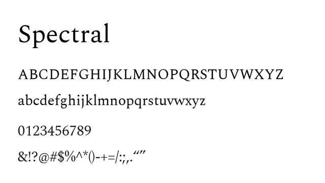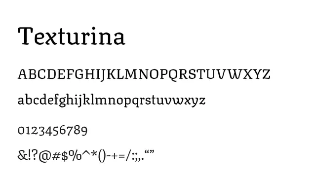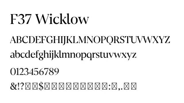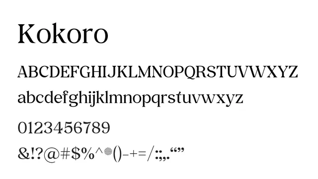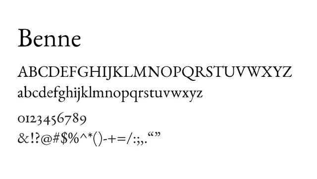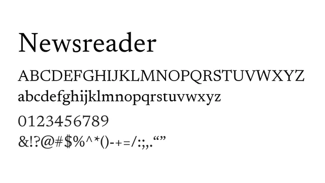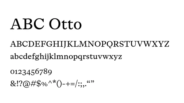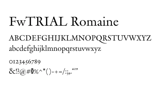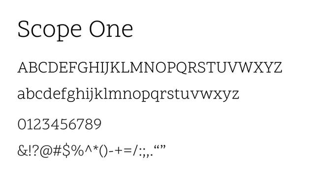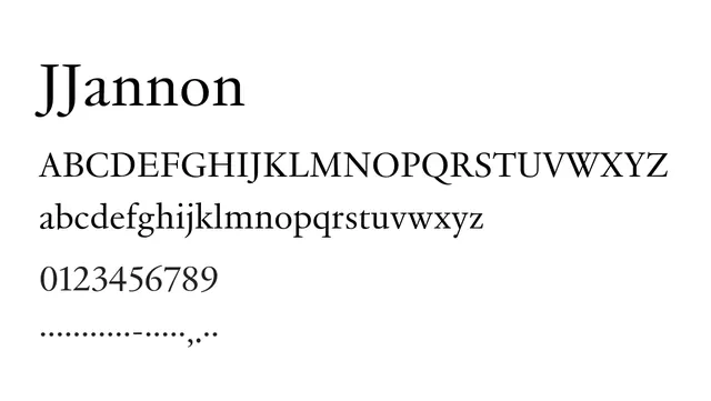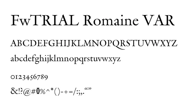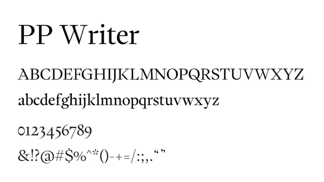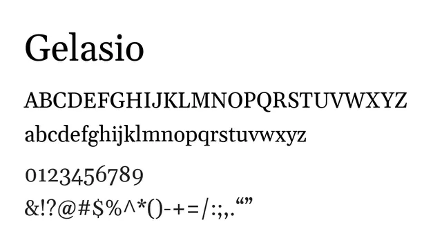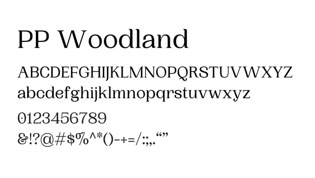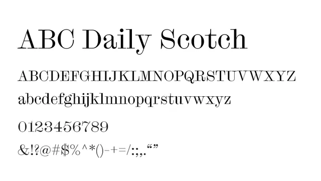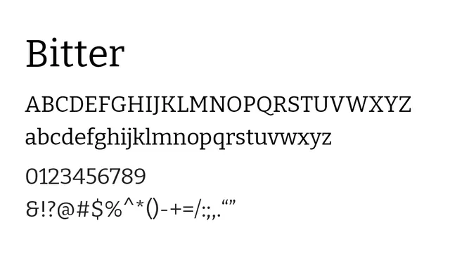
Preview image. Unlock full-res
What to use it for
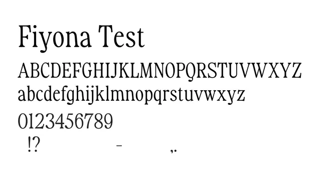
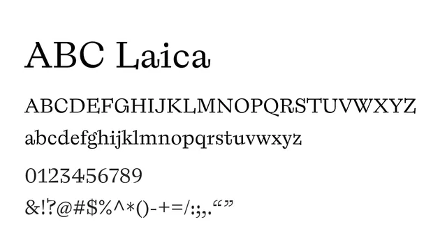
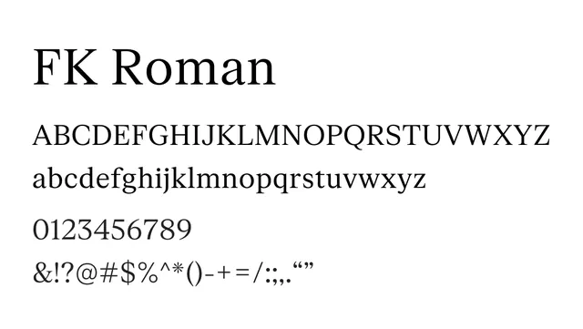
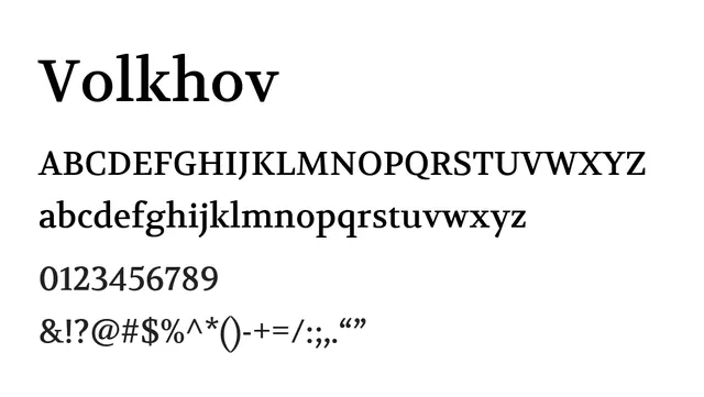
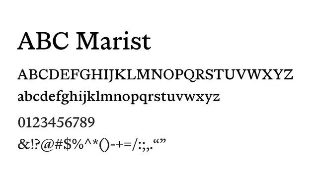
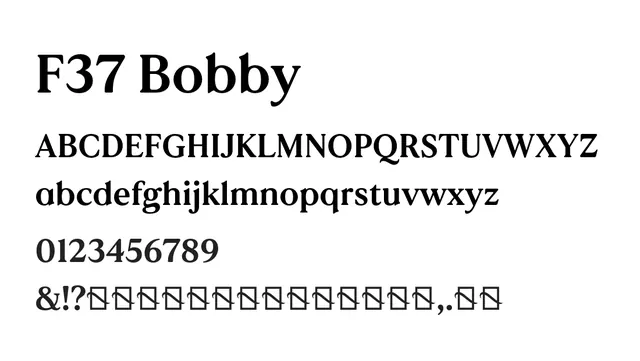
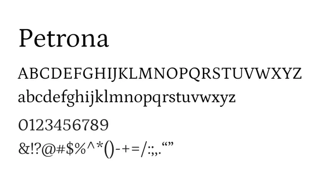
Ideal for editorial projects, book design, and magazine headlines. The generous x-height and readable letterforms work well for both headlines and body text in publications.
Pairing
Pair with a geometric sans-serif like Poppins or Inter for contemporary editorial layouts that blend classic and modern aesthetics.
TypeSerif, Transitional
MoodSophisticated, Confident, Classic, Warm
IndustryEditorial, Publishing, Branding, Fashion