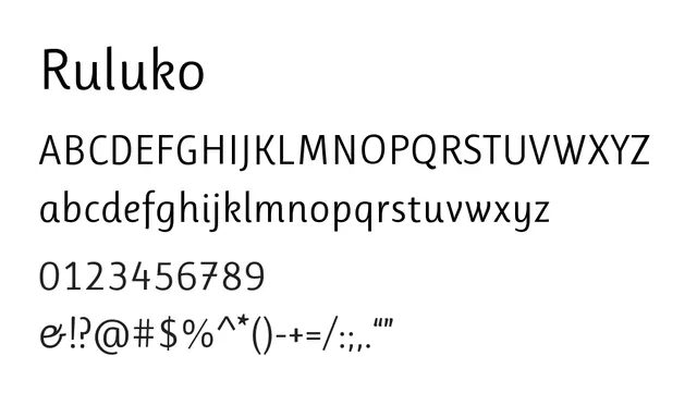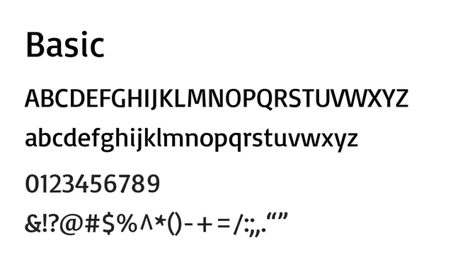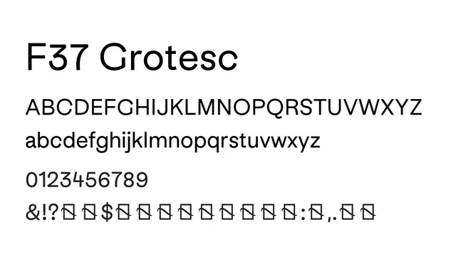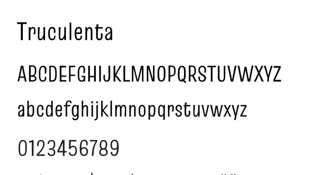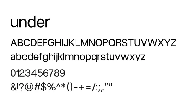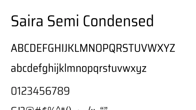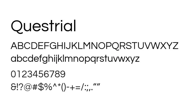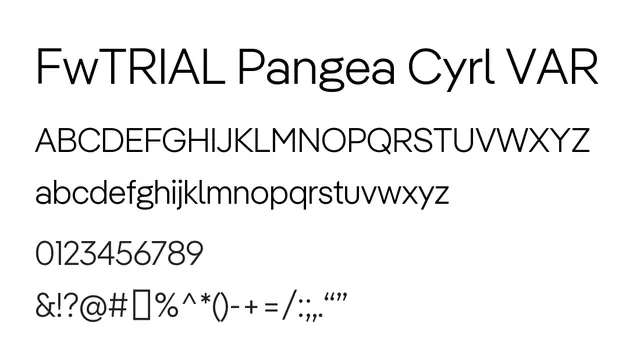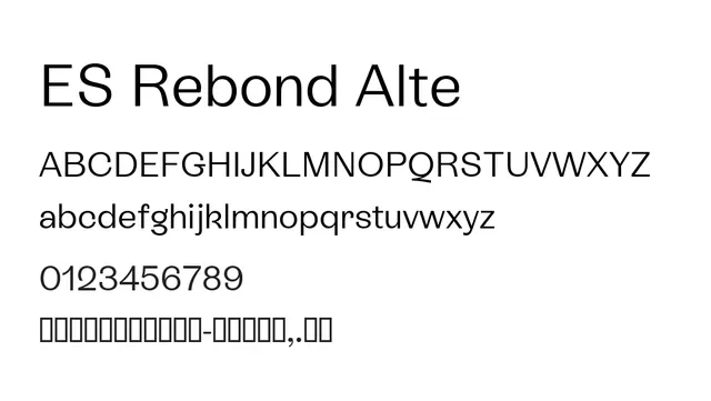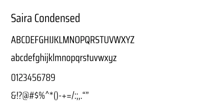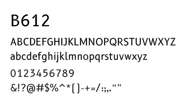
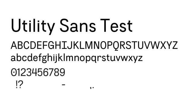
Preview image. Unlock full-res

What to use it for
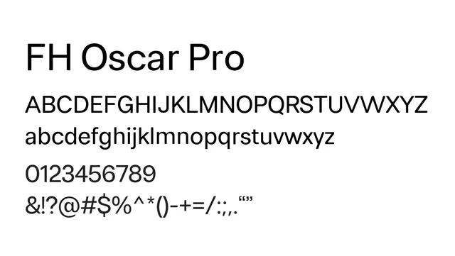
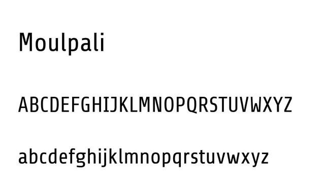
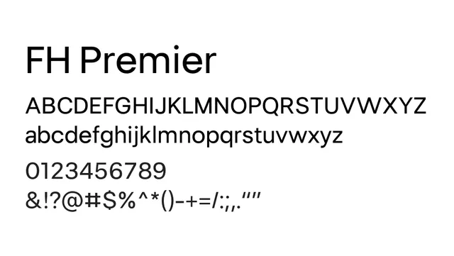
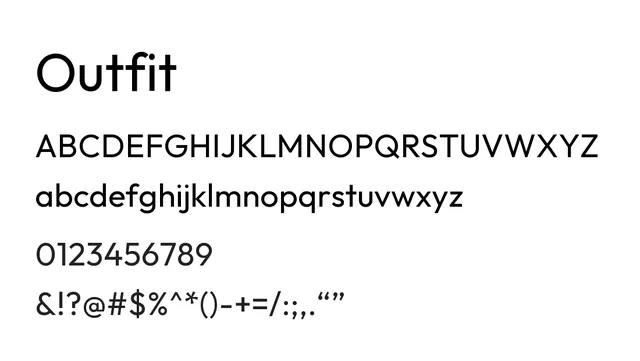
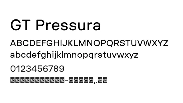
Excellent for user interface design, body text in web and app environments, and corporate communications. The clear letterforms and low contrast provide maximum legibility at small sizes and on screens. The minimal character suits data-heavy interfaces and technical documentation.
Pairing
Works with B612 Mono for code-UI hierarchies; pairs with geometric display fonts like Averia Sans for contemporary layouts; combines with any serif for editorial contrast.
StyleTechnical, Clean, Minimal, Functional
TypeSans Serif, Neo Grotesque
MoodNeutral, Professional, Clear, Accessible