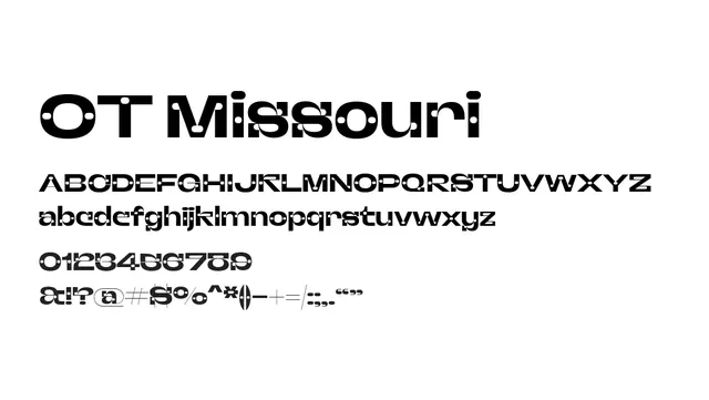
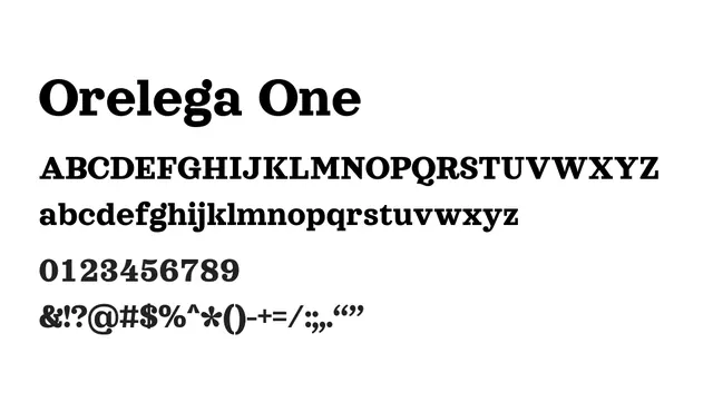
Preview image. Unlock full-res
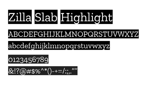
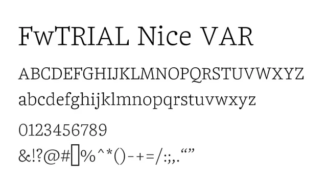

What to use it for
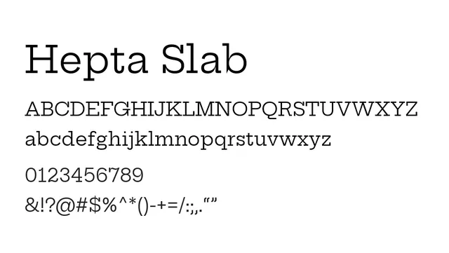
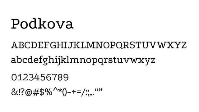
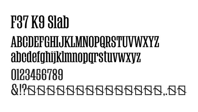
Best used for headlines, display purposes, and branding where visual impact is key. The geometric slab serifs are too heavy for comfortable body text reading; reserve for larger sizes and emphasis.
Pairing
Pairs well with clean humanist sans like Albert Sans or Inter for body text to provide contrast between display geometry and readable neutrality.
TypeSlab Serif, Geometric
MoodConfident, Strong, Bold, Contemporary